My Role
UX Designer and Researcher
Tools
Figma, Photoshop
The Challenge
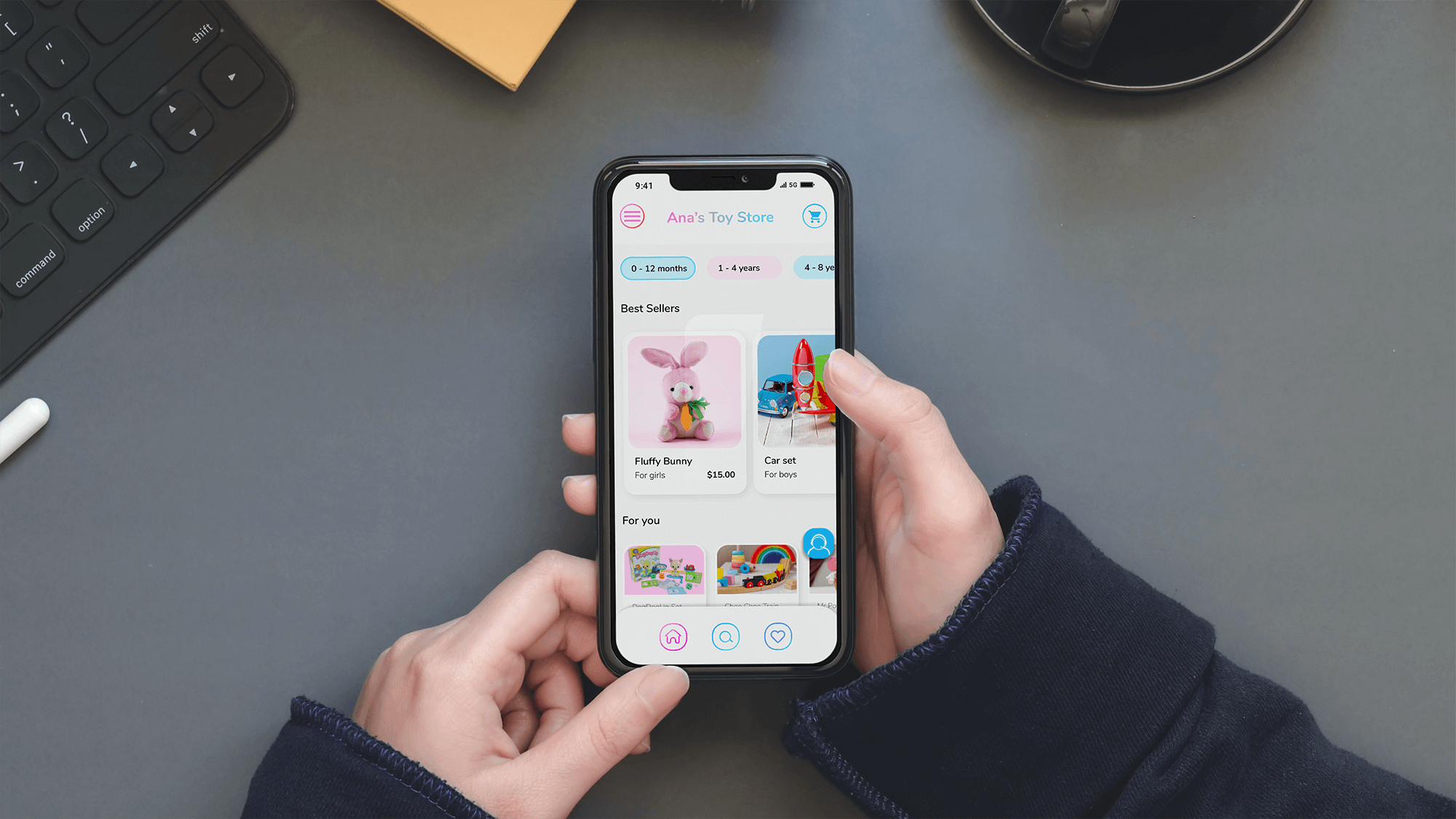
Design an E-commerce app focused on children-related items
Ana’s store would offer a place for high-quality toys, to help the user to buy easily.
discovery
Research, the key for a solid product
Competition
It is important to look into real products on the market. I analyzed each one: User and products goals, user interface, and user experience on different flows (Onboarding, sign up, purchase, etc)
Audience
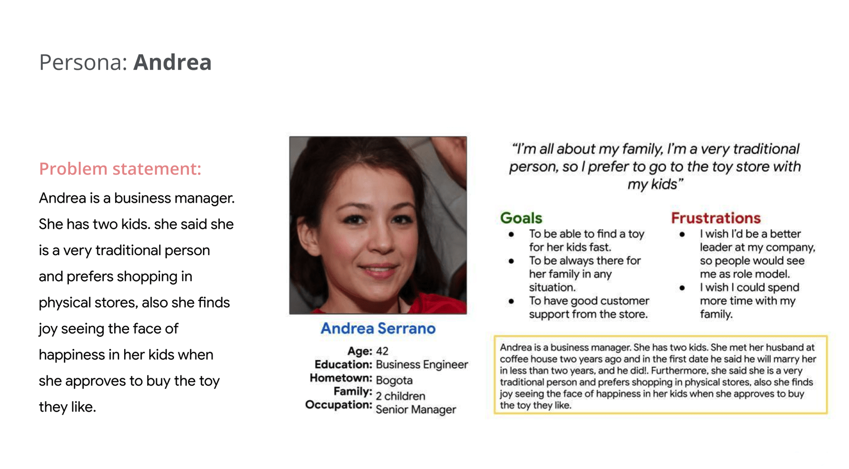
I created the tentative user Personas. I divided into 2 main targets: occasional buyers and frequent buyers, and inside them 2 types of different personas. I analyzed: behaviors, expectations, pain points.
Journey maps
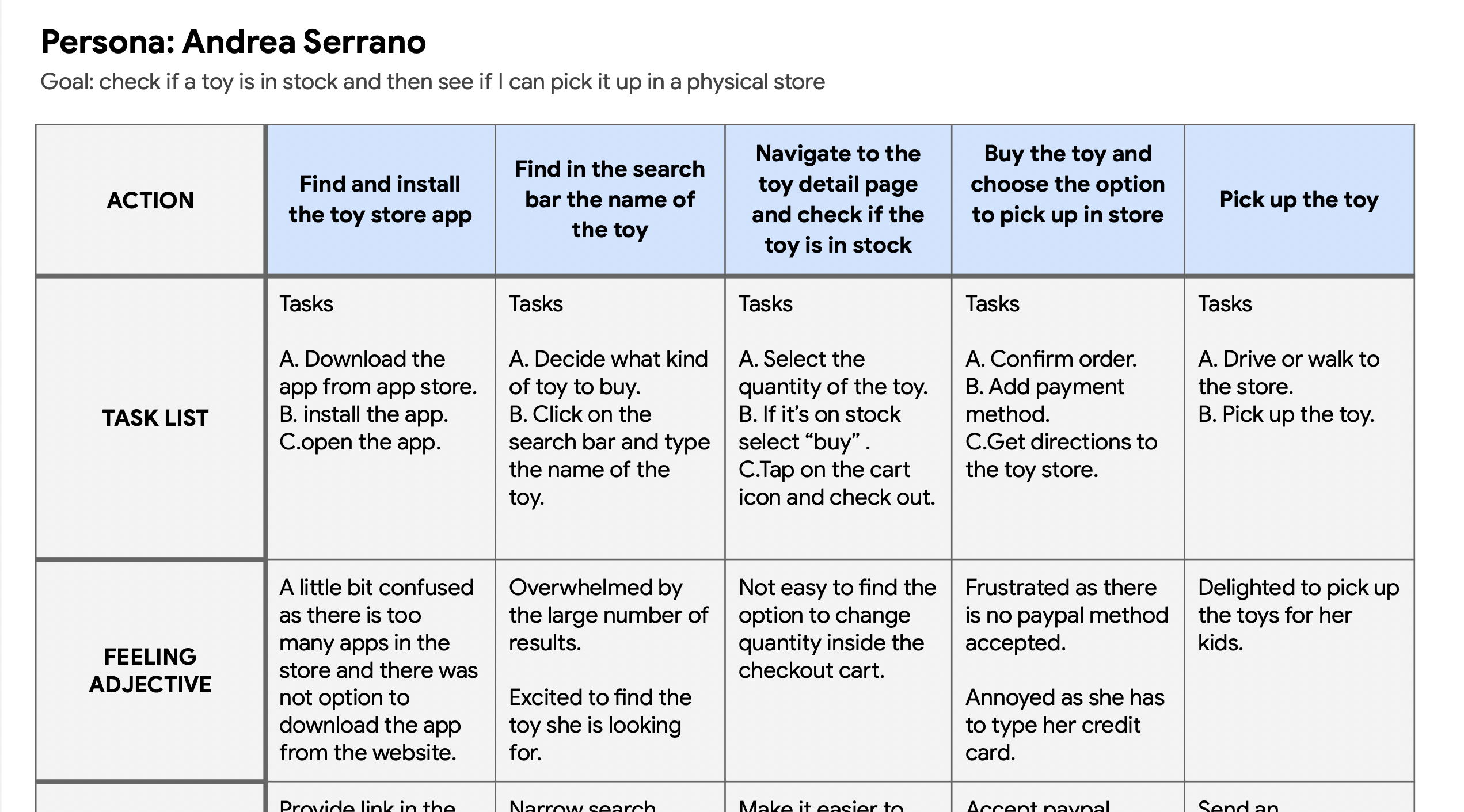
I conducted interviews and created Journey maps to understand the users I’m designing for and their needs. A primary user group was working adults who have kids and like to shop online.
Starting the design
Ideation
With the research findings and personas in mind, I brainstorm solutions. I tried to come up with as many ideas as possible without considering feasibility at this stage and the developed paper wireframes, digital wireframes and low-fidelity prototypes.
Paper Wireframes
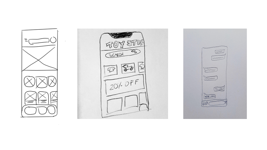
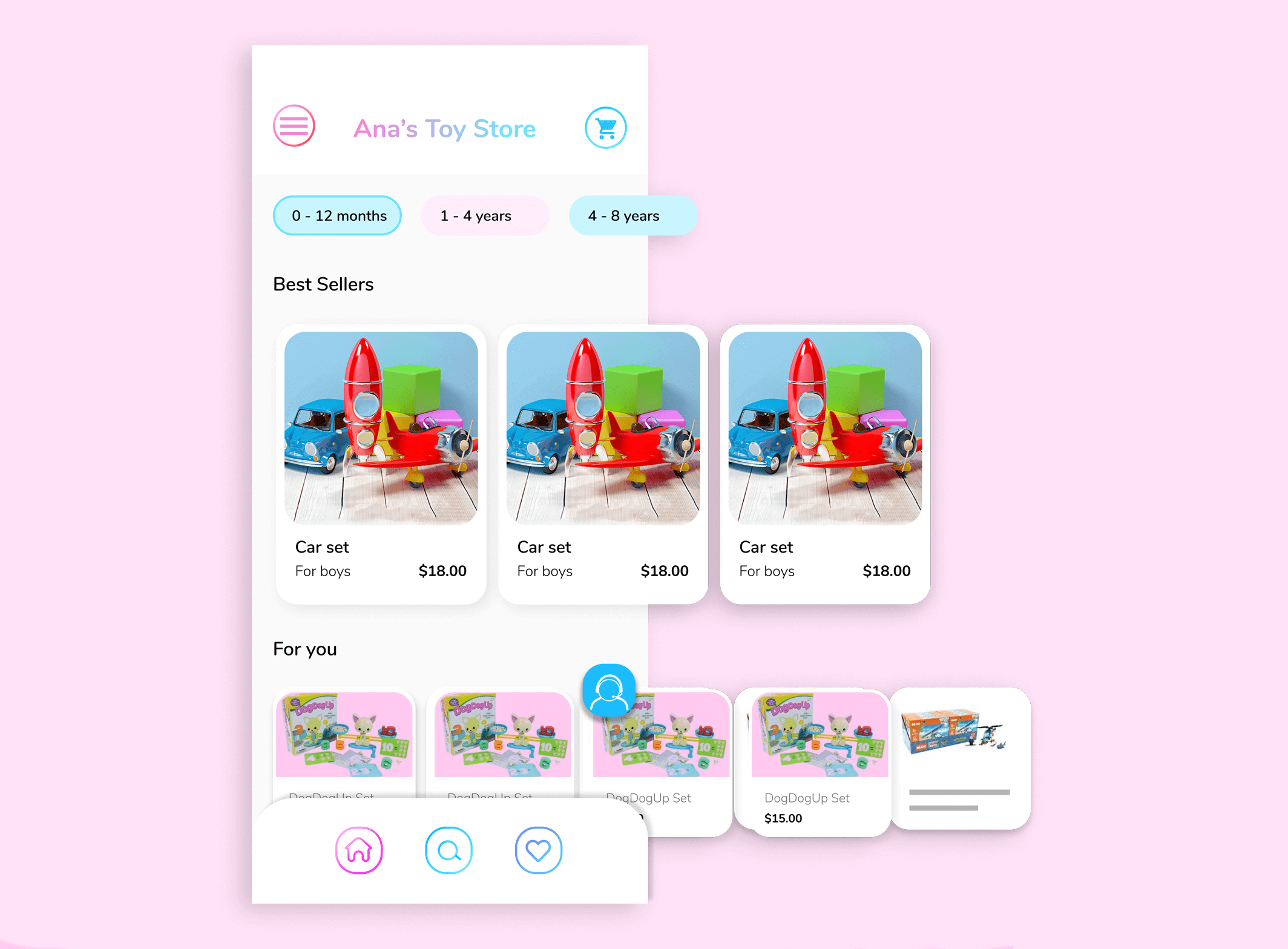
Taking the time to draft iterations of each screen of the app on paper ensured that the elements that made it to digital wireframes would be well-suited to address user pain points. For the home screen, I prioritized a horizontal list of cards.
Digital Wireframes
Low-fi prototype
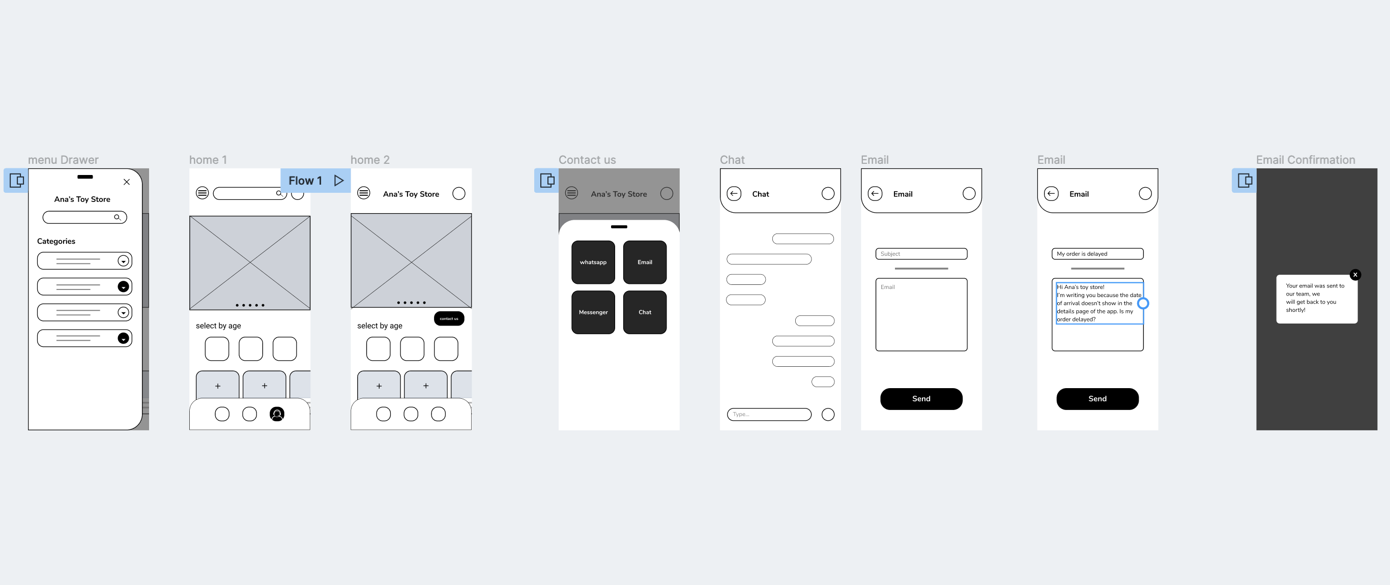
I quickly drew out sketches of these functionalities
The primary user flow I connected was contacting customer support.
High-Fidelity - Iteration 1
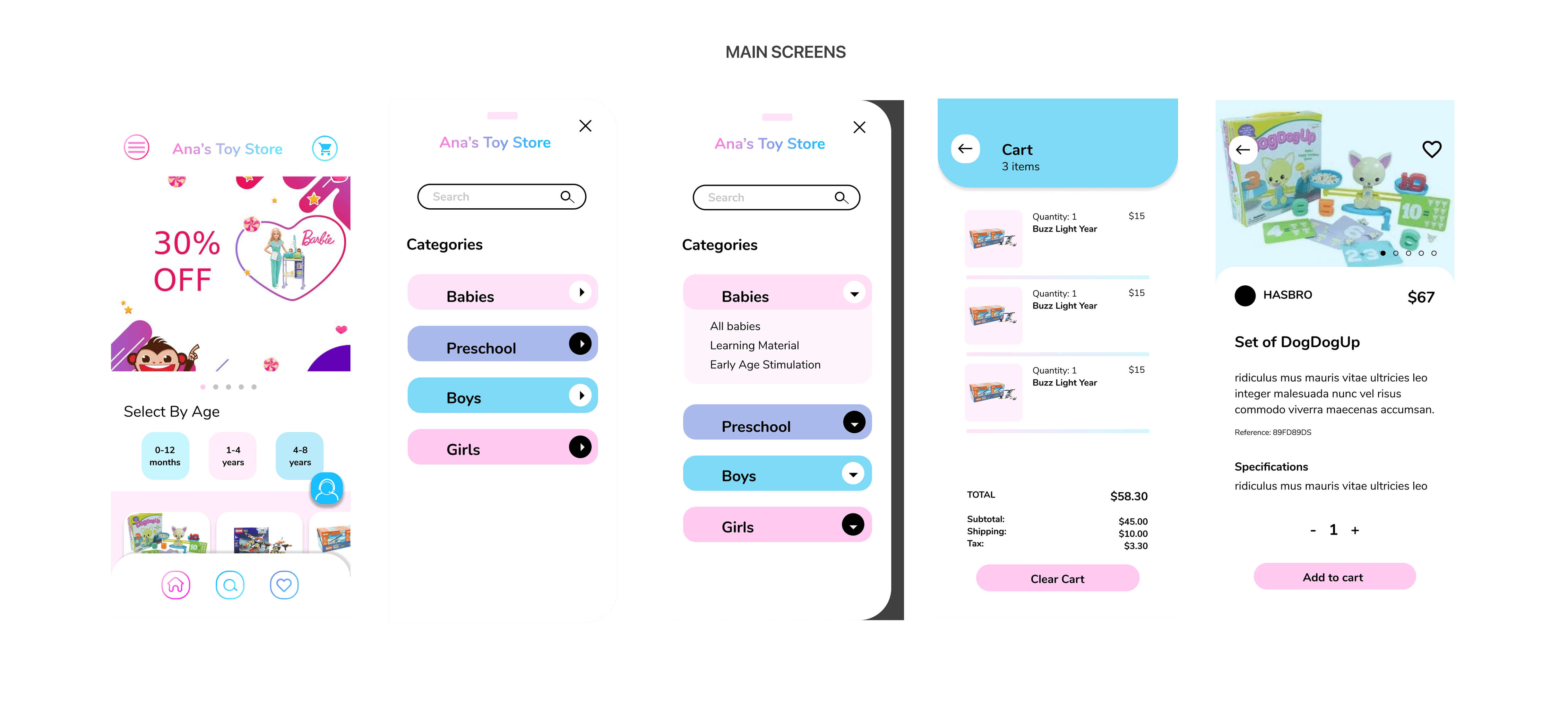
For the first iteration, my main goal was to validate whether the design helps different types of users navigate the main user interfeace with ease. I also hoped to test the usability of the design, so that I can improve upon it.
Product arquitecture
Minimal aesthetic
Toy Store uses a minimalist aesthetic, creating an experience where content and actions take the forefront of the user experience. Toy Store's brand plays an important role as the central, unifying scaffolding for the variety of products and brands showcased.
Curved Borders
Curved borders are a visual theme in the app, and are used on various components and elements. They reflect the shape of the store logo, and act as an extension of the store brand.
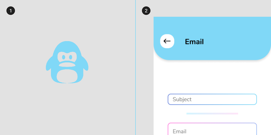
The app logo and examples of curved angles in the app UI
Overlapping sheets
The underlying theme of the app interaction model is that of three overlapping sheets. The bottom sheet has the main content; the middle sheet has the bottom navbar and the topbar; and the top sheet has the the contact customer support button.
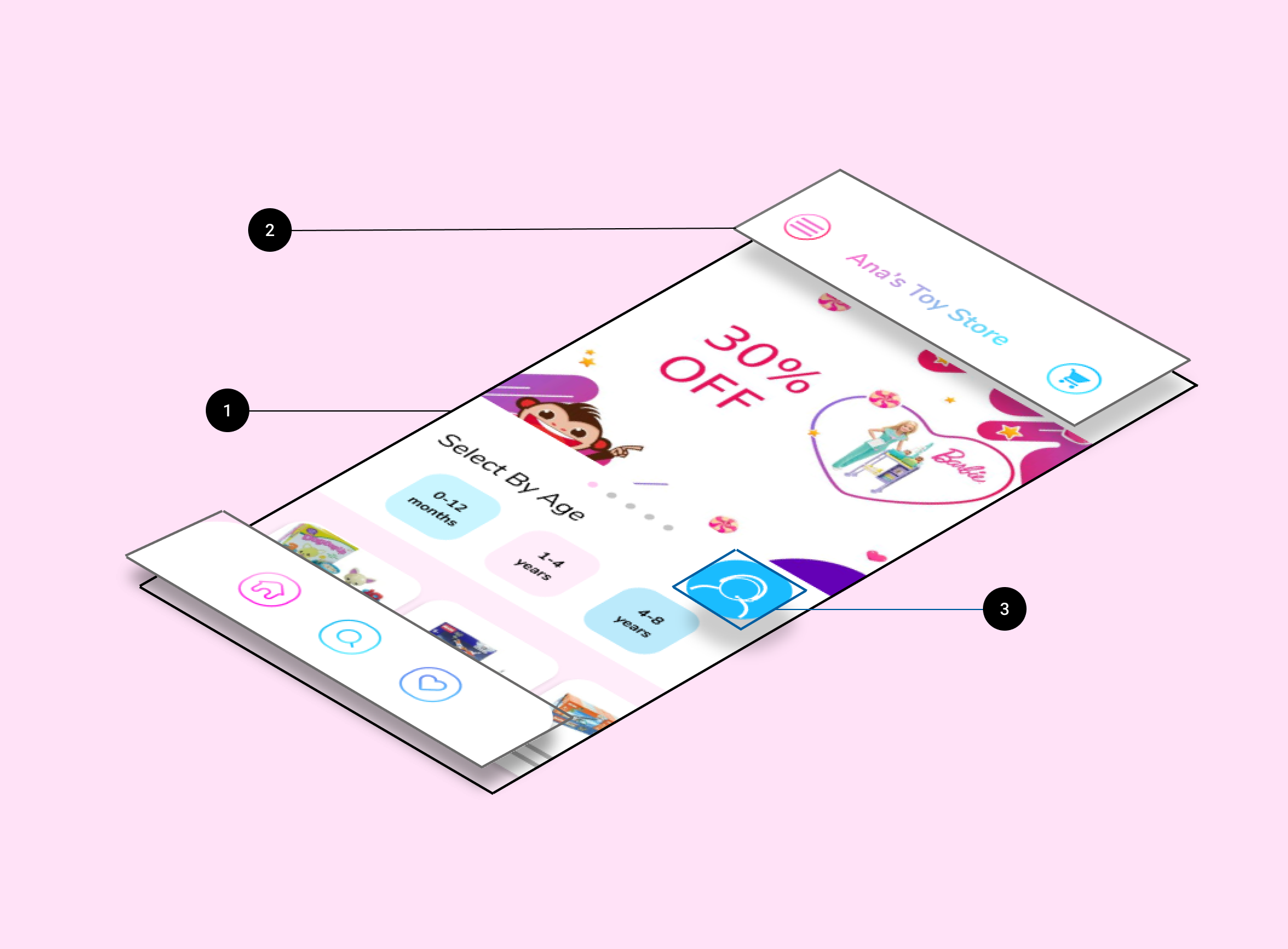
- Bottom sheet
- Middle layer
- Top layer
IA
The app’s information architecture has a catalog structure. A catalog contains categorized list of items. Toy Store's top level categories group ages and genders (babies, preschool, boys, girls), so there is a clear way to find a toy. Adopting a catalog structure allows users to browse an area of interest, compare items to each other, and view the details of a specific item.
Dropdown menus
All navigation patterns share the same selected state: when a dropdown button is tapped it displays the subcategories.
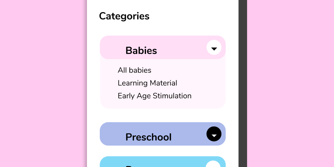
Shopping cart
The shopping cart can be accessed through a button at the top right of the screen. As items are added or removed from the cart, the sheet dynamically updates to reflect the changes. This sheet can expand to show its content, or take the user to the shopping cart screen by clicking the cart icon.
Layout
Toy Store uses a responsive grid system, allowing padding and column size to change between mobile, tablet, and desktop.
Color
The app color theme is monochromatic, using light and dark variations of the primary color Toy Pink. The app’s primary color (Toy Pink 100) fills the back layer, and the secondary color (Toy Pink 50) fills the bottom sheet. The main content is on white, and the dark Toy Pink 900 is used for typography and iconography.
.png)
Typography
The app type scale provides the typographic variety necessary for the app content. All items in the type scale use Nunito as the typeface, including Nunito Light, Regular, and Semibold.
.png )
Components
The app showcases a variety of components. From beautiful Icons to stylized but modern buttons, including contrasty dropdown menus.
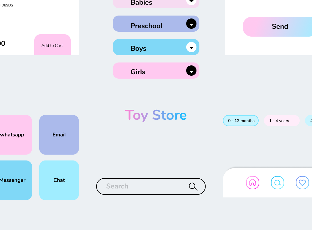
Prototype
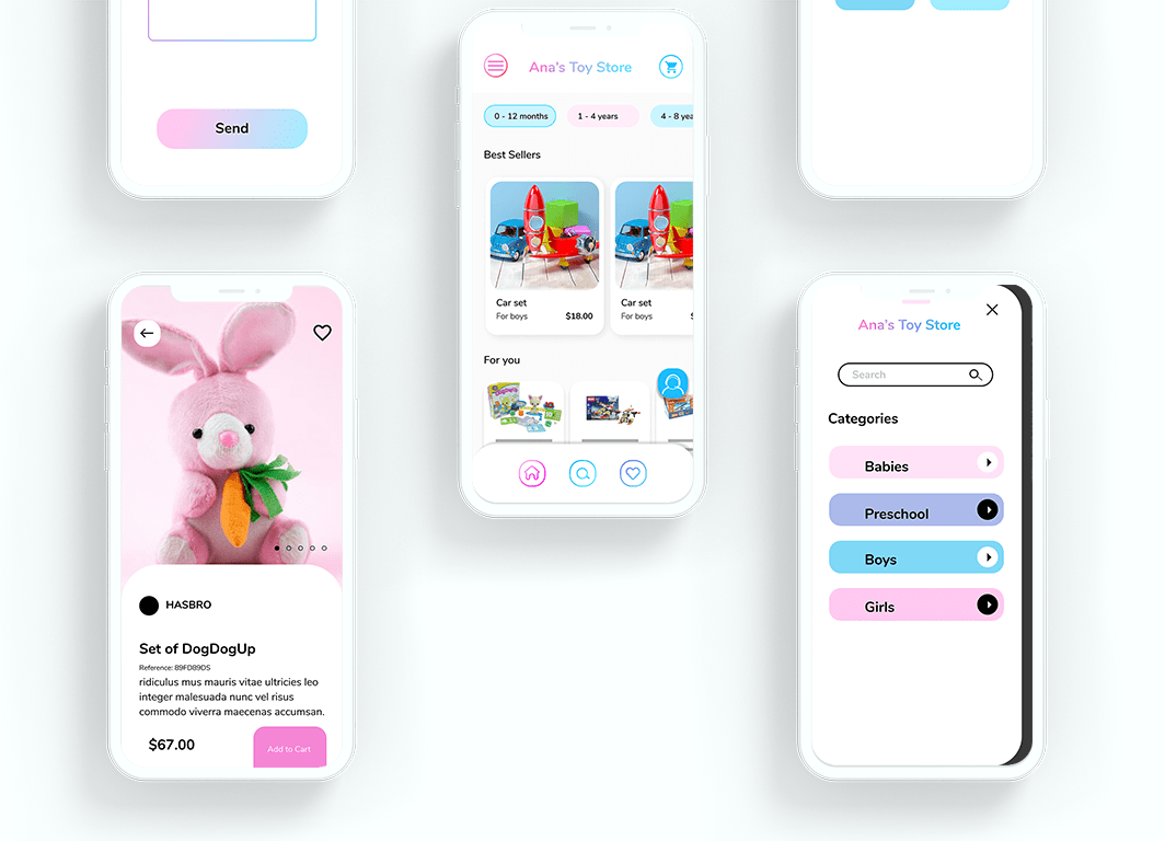
Here's the first prototype of the checkout flow. Try adding the pink bunny to the cart and then checkout.
Design
Prototype Insights
After the prototype, I found problems with the homepage.
- The bottom navbar didn’t work
- It felt that something was missed
The biggest challenge I faced throughout this project was balancing moving forward with the designs, we spend a lot of time changing copy and images.
Motion
Launch screen
One of the Store's mascot plays a central role in the animation.
takeaways
The Tools
I made the designs using different tools. But I would like to highlight Figma (Round of applauses!).
Figma is the most powerful design software I know.
Other tools that help me bring this project to life were: Photoshop, Asana, and Google Meets.

