Neodemy
The Challenge
There is a lack of a good, modern and intuitive experience to learn a career path in the neodemy website.
There is a lack of a good, modern and intuitive experience to learn a career path in the neodemy website.
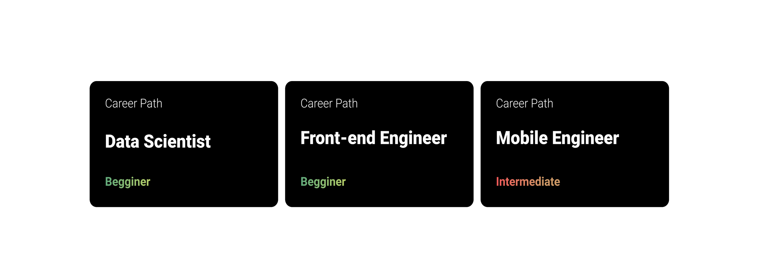
I designed a beautiful, simple recommendation flow to help potential students find the right career path. This flow uses AI to recommend career paths based on the student's skills and interests.
UX Design and Research Lead
September 2021
Figma, Photoshop, Protopie
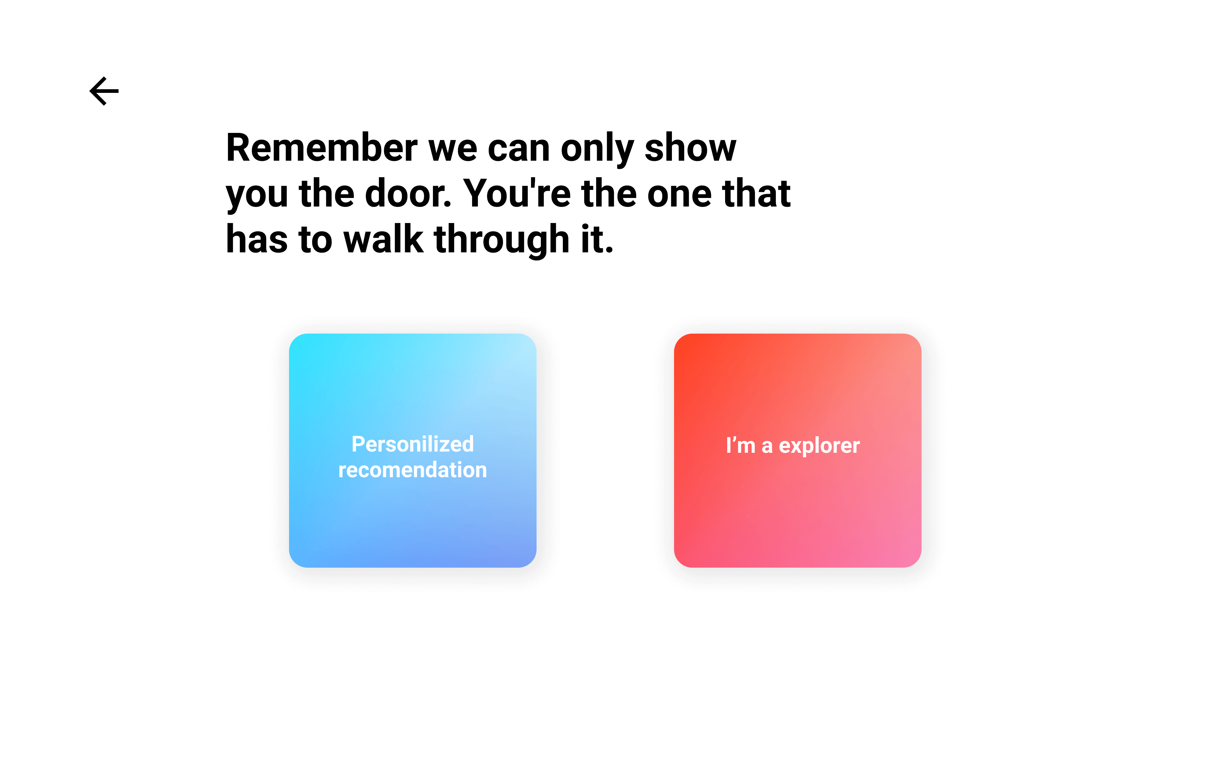

As the Lead UX Designer and Researcher, I conducted competitive analisys before arriving at solutions.
I led all the research & design activities, created wireframes, high-fidelity designs, and interactive prototypes for user feedback & testing.
We first looked into the market to check whether existing products can help students better choose a course or a career path in their platforms.

We found that:
Therefore, I hope to create a tool that can tailor to the needs of potential students, to help them quickly understand what each is course is about, and predict which course fits their profile better.
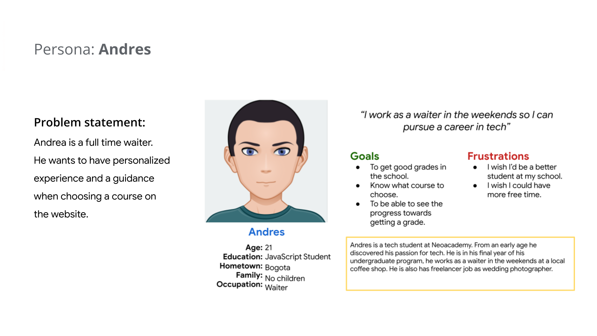
To better guide the design, I came up with the following personas:
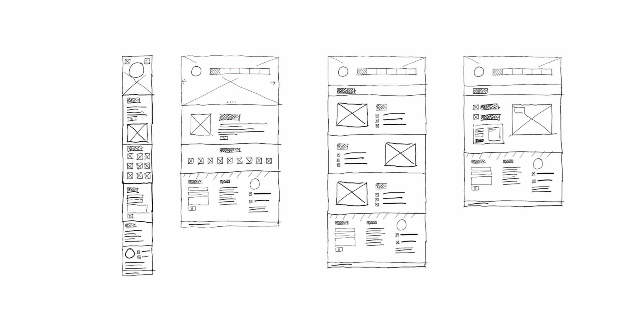
With the research findings and personas in mind, I sketched the main screen for desktop and mobile . I tried to come up with as many ideas as possible without considering feasibility at this stage.
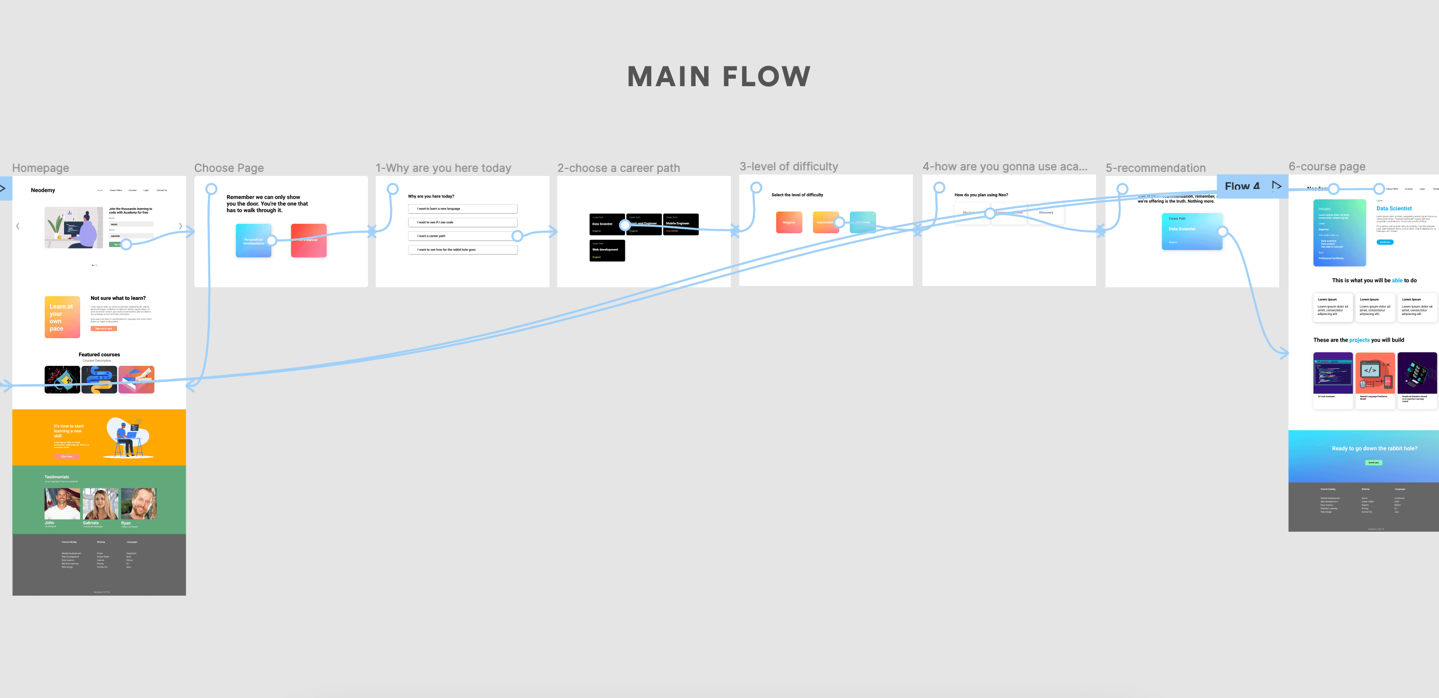
The first prototype focuses on the main flow on how to choose a career.
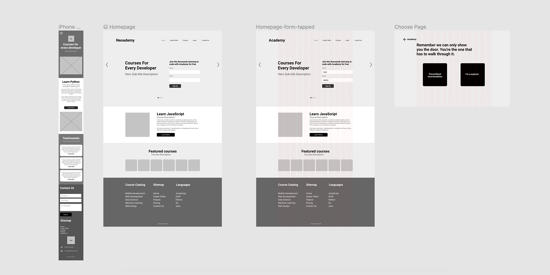
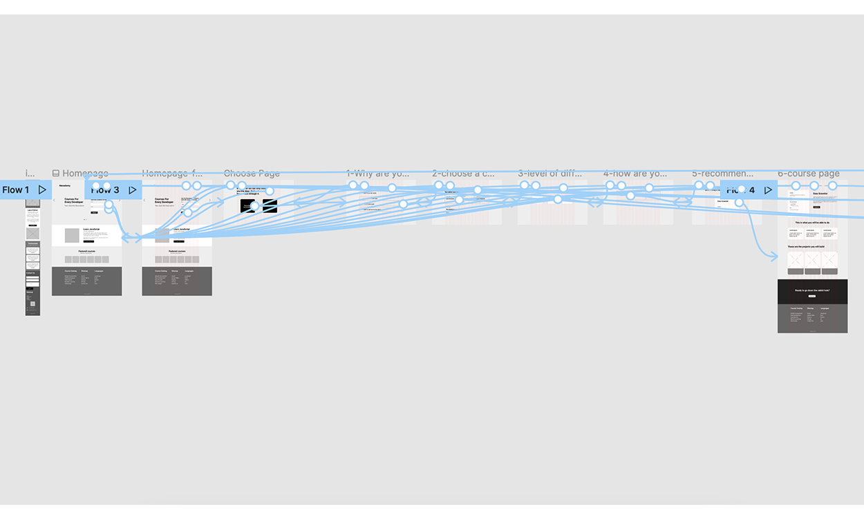
For the first iteration, my primary goal is to validate whether the design helps different types of users choose a career. I also hoped to test the usability of the design, so that I can improve it.
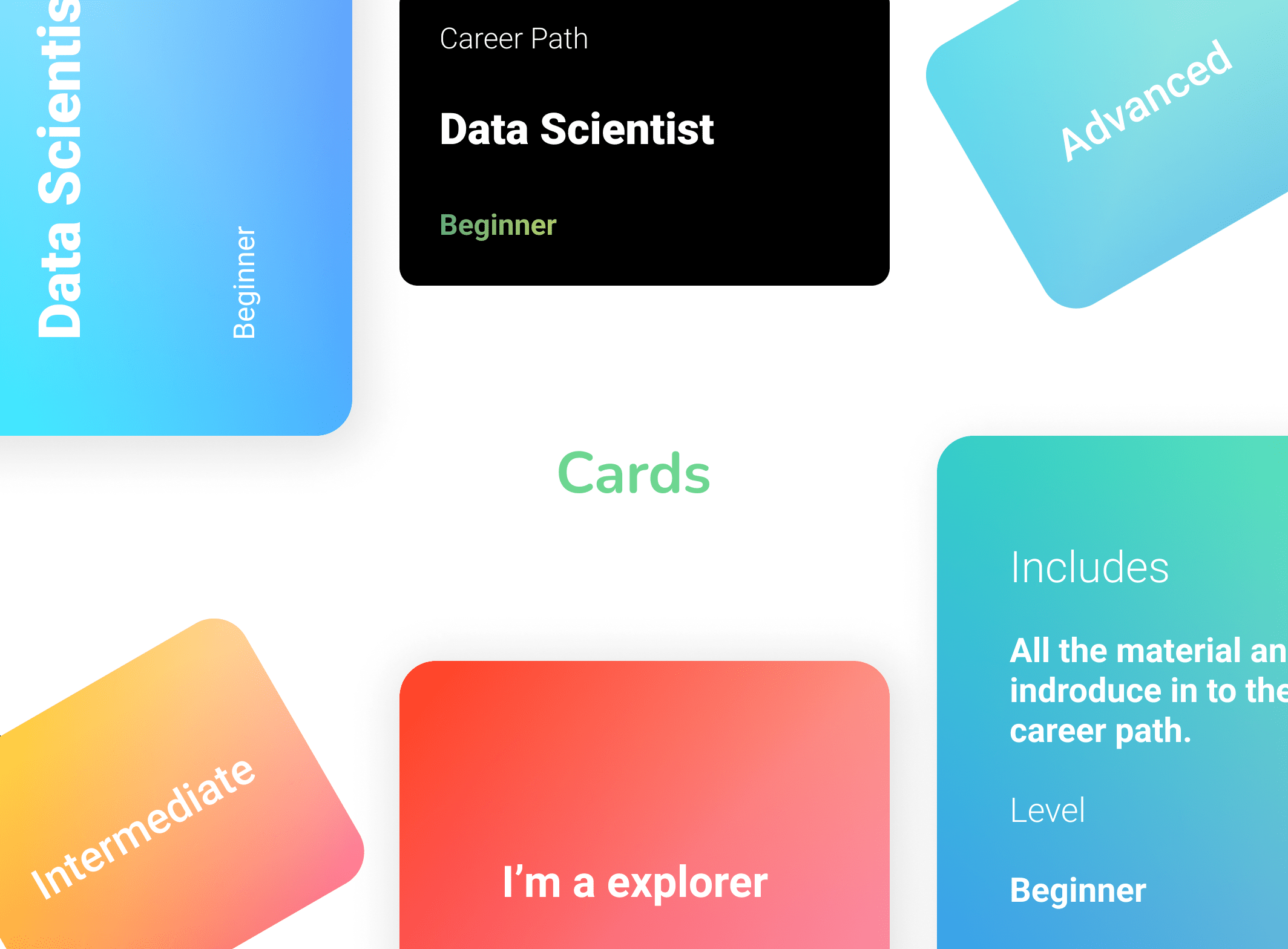
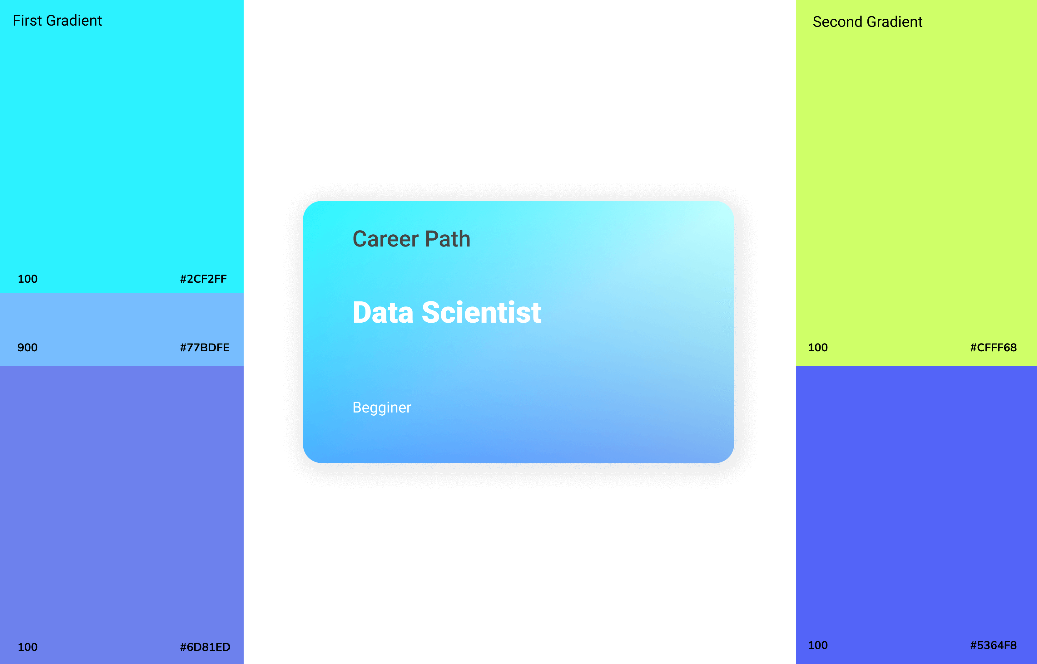
Colorful gradient cards are use as buttons and to display grouped information.
In order to give the 3D effect to the cards it was required to apply two sets of Figma gradients, the first one with three colors and the second one with only two.
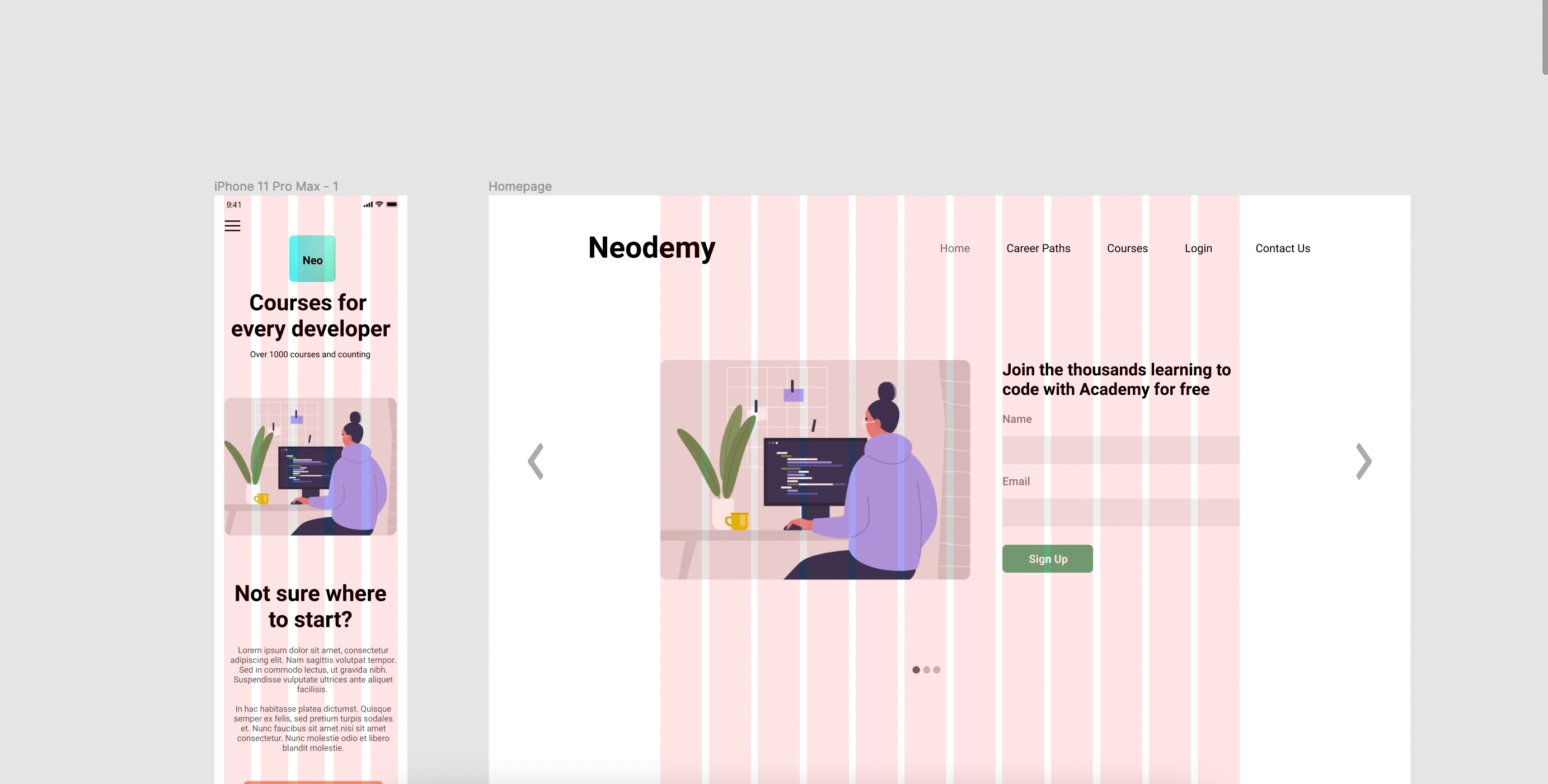
Neodemy uses a responsive grid system with 12 columns on desktop and 5 columns on mobile, 20 pixeles of margin for the mobile version, allowing padding and column size to change between mobile, and desktop.
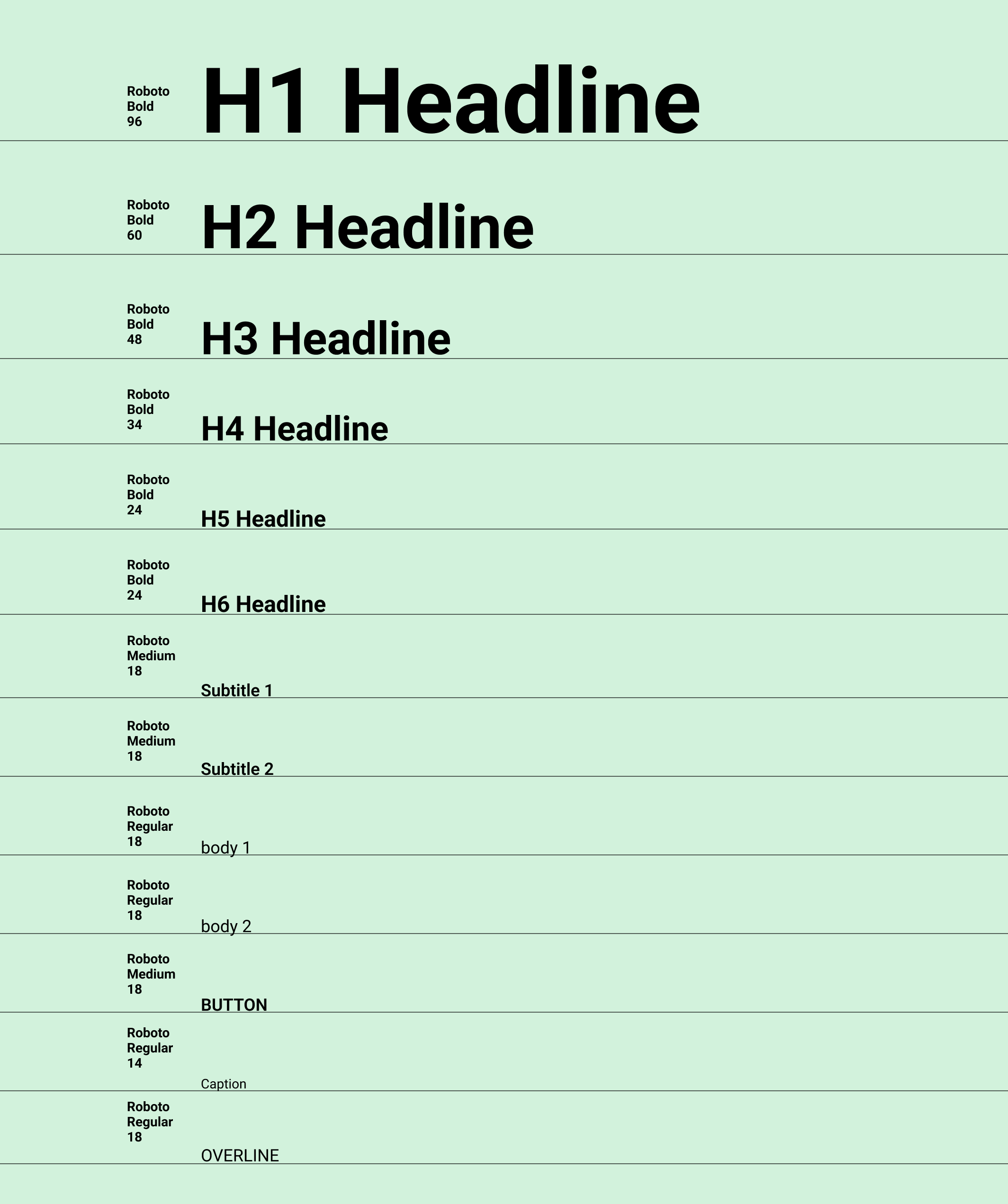
The website type scale provides the typographic variety necessary for the website content. All items in the type scale use Roboto as the typeface, including Robot Light, Regular, Semibold and Bold.
Here's the latest prototype of the main flow.