My Business App
The Project
Design the booking functionality for My Business app, where users can book appointments, and see their current and future events.
Design the booking functionality for My Business app, where users can book appointments, and see their current and future events.
Created concepts, UI and prototypes with Figma, validate them with end users and implement them well together with development, and created, maintained and expanded design systems.
Semi Senior UX Designer
June - November 2022
Mavenir.com
Figma, Photoshop, Miro, Jira, Teams
Mavenir is a technology company that specializes in providing mobile solutions for businesses. In order to enhance their offering, they have created an app called My Business, which is designed to help small businesses manage their operations.

I did a comparative evaluation against competitors. The aim was to identify a baseline or benchmark from which to set goals before diving into design.
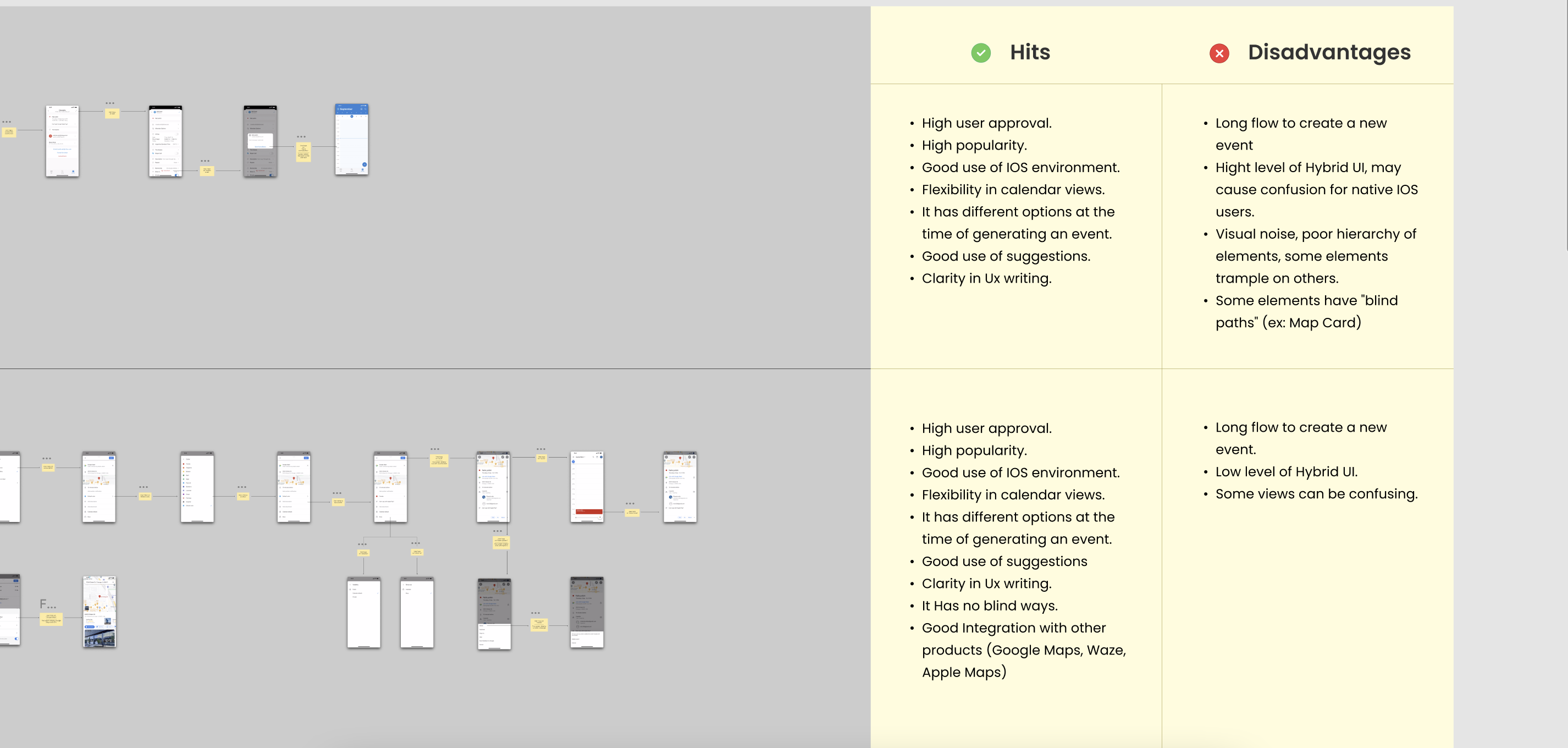
There were some commonalities in the apps I research. I found that:
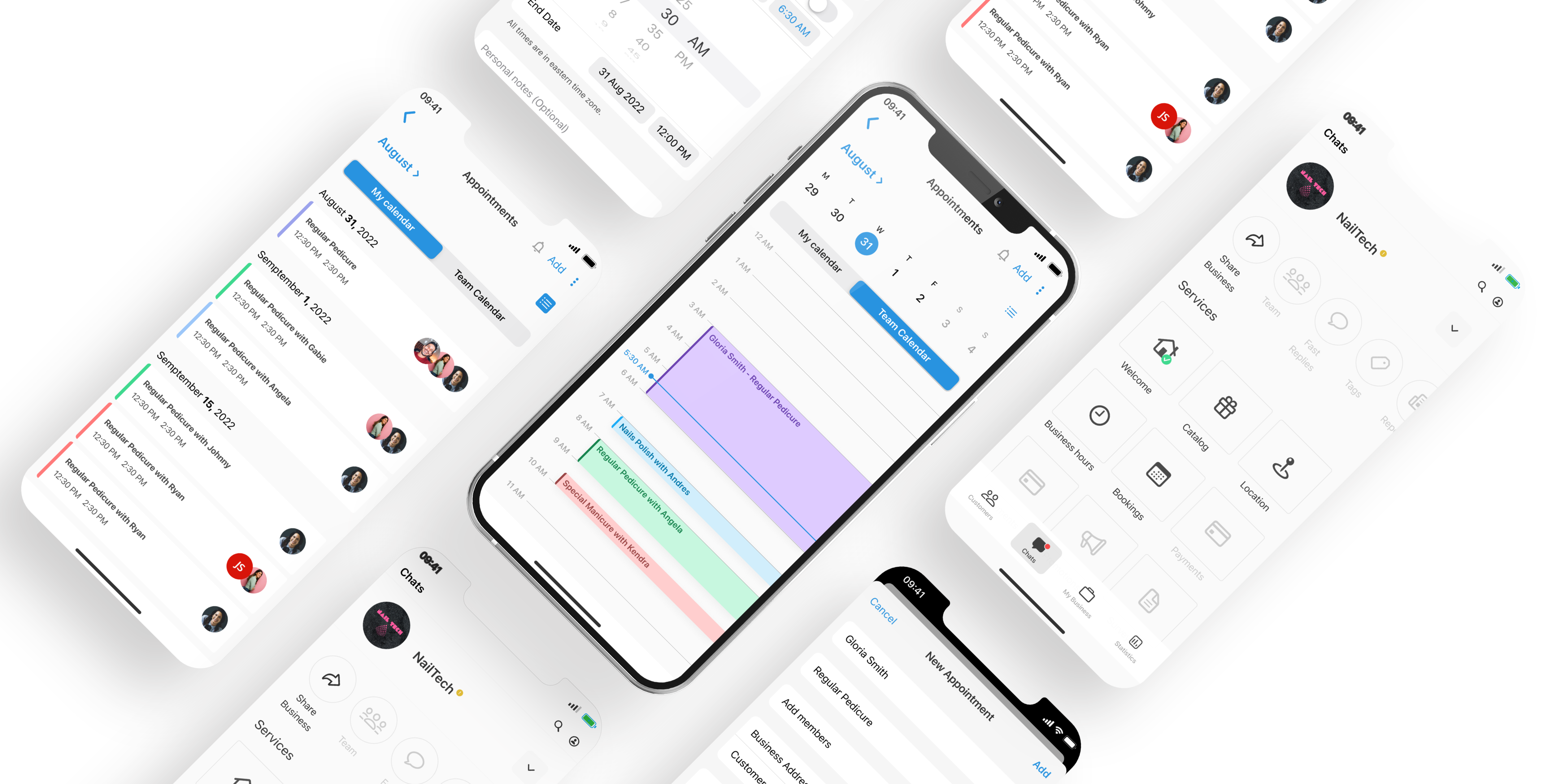
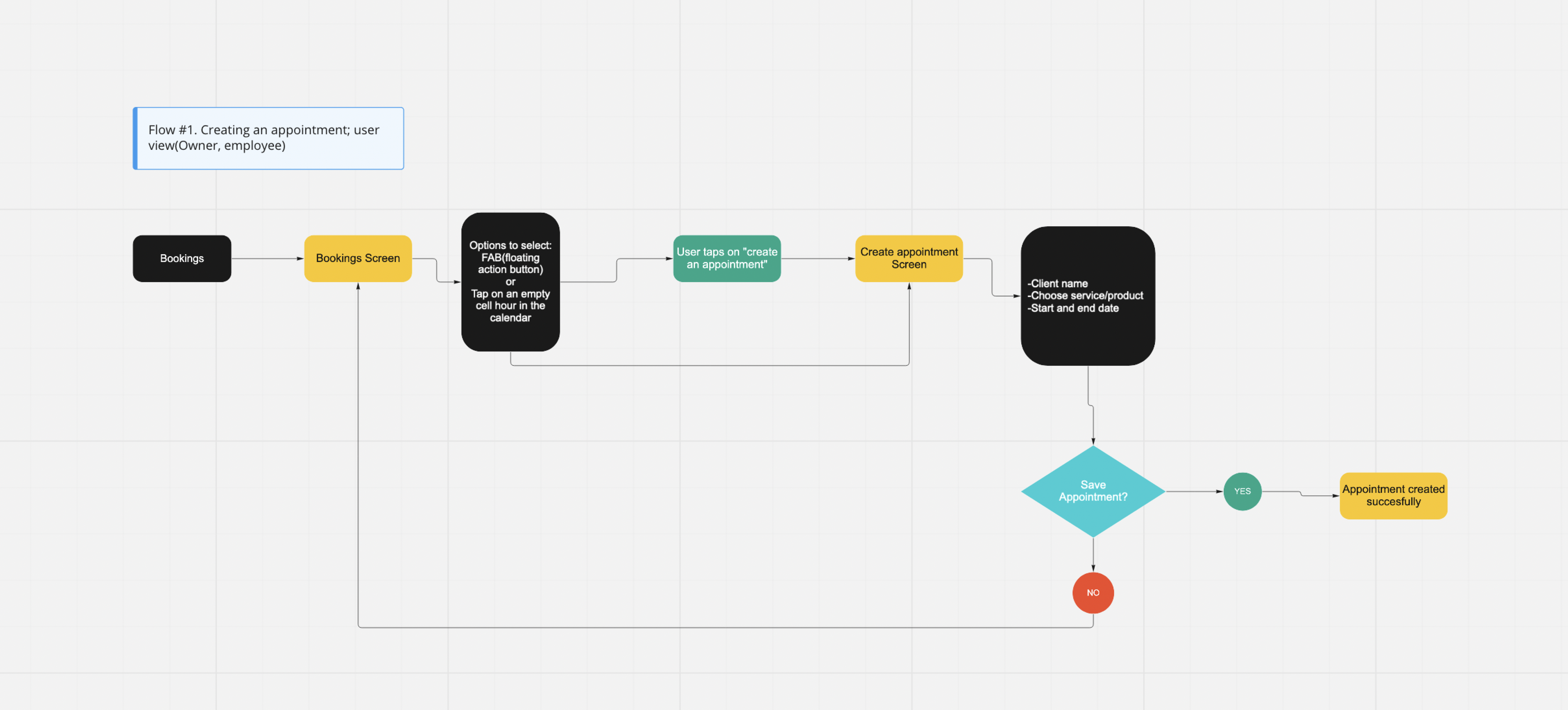
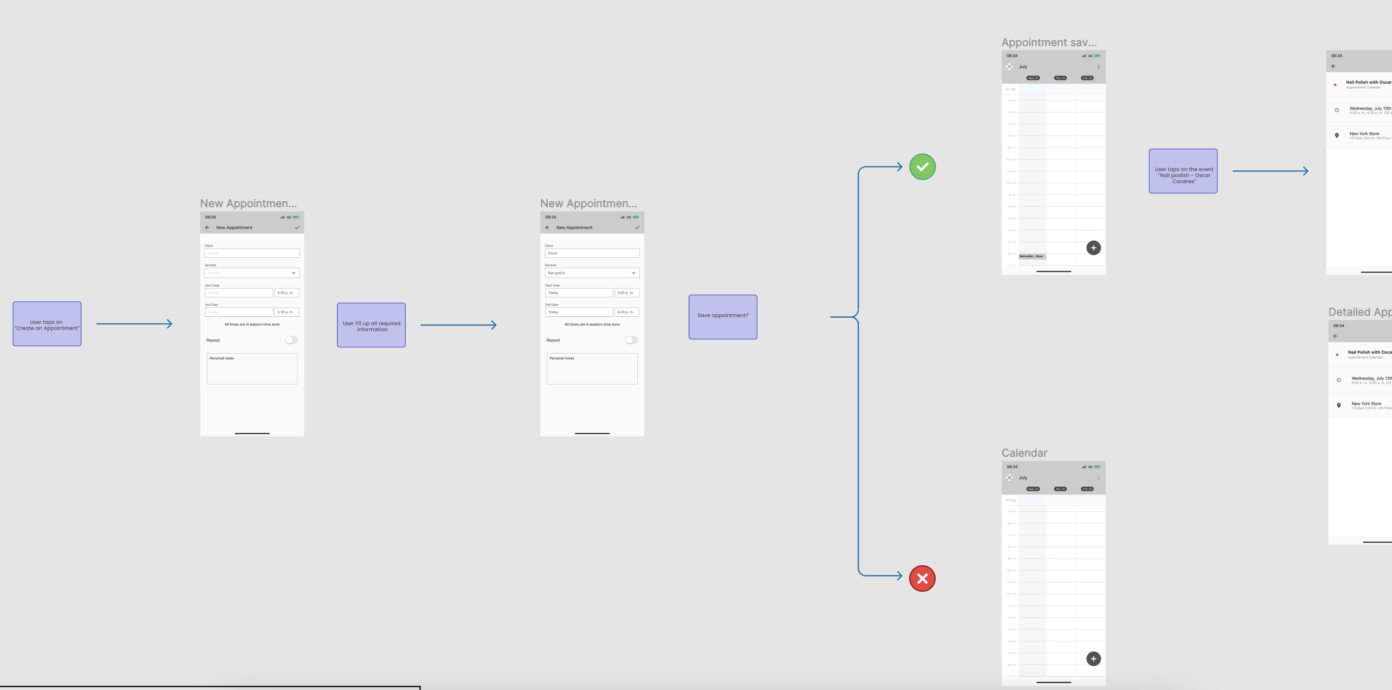
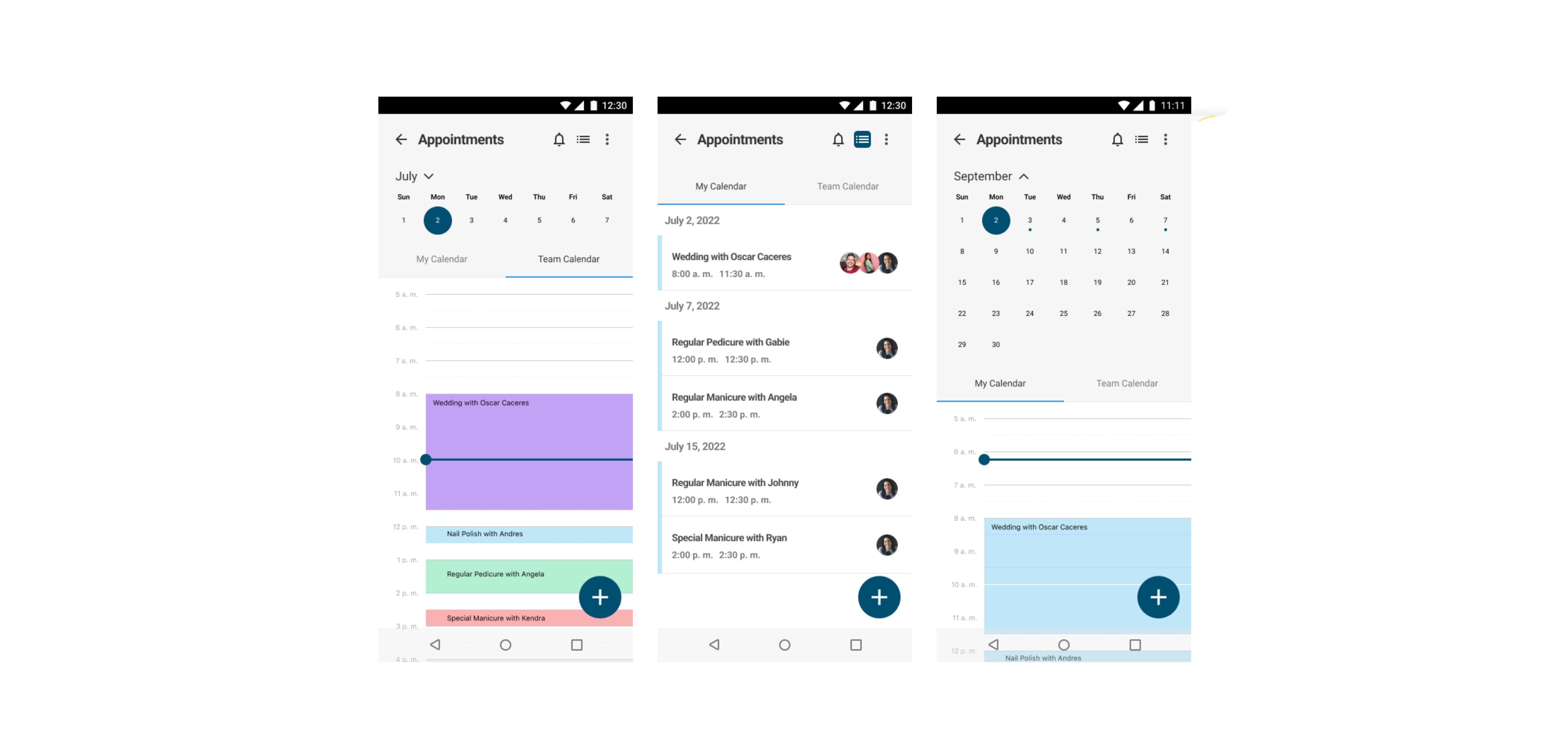
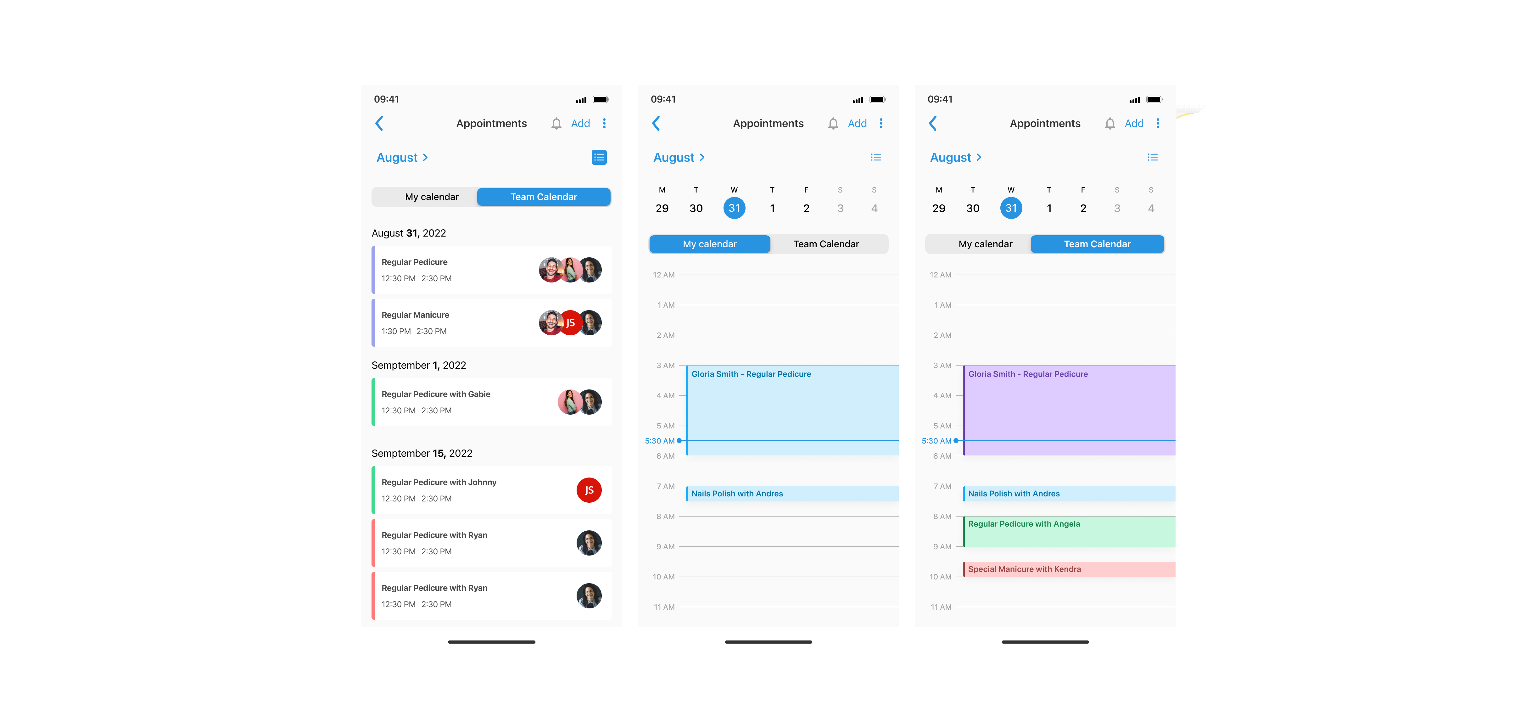
The first step for me was to create user flows to mentally visualize how users would travel through the app while performing a specific task (in this case creating an appointment).
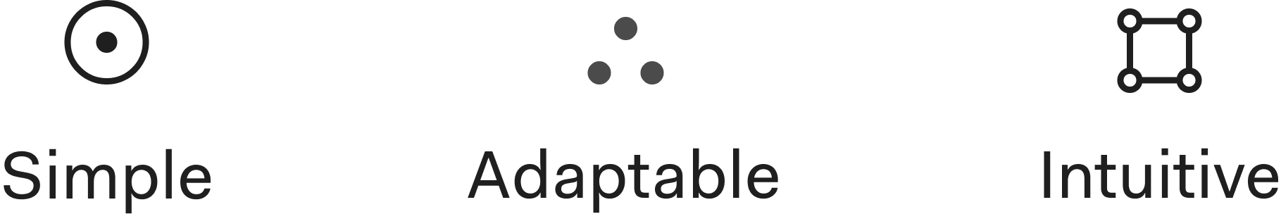
Based on the requirements, multiple meetings with the product owner and the product needs of the project I tried to come up with a design philosophy for the feature.
Eventually, I settled on the following design principles
After creating the main task flows the next natural step was to create low-fidelity wireframes to visualize how the target audience will interact with the feature. This is important to understand how different users might not perform tasks the same and may travel in different paths. They are typically attached to a specific persona but in this case, I just wanted to focus on understanding the main user flows so I skipped the creation of user-personas.
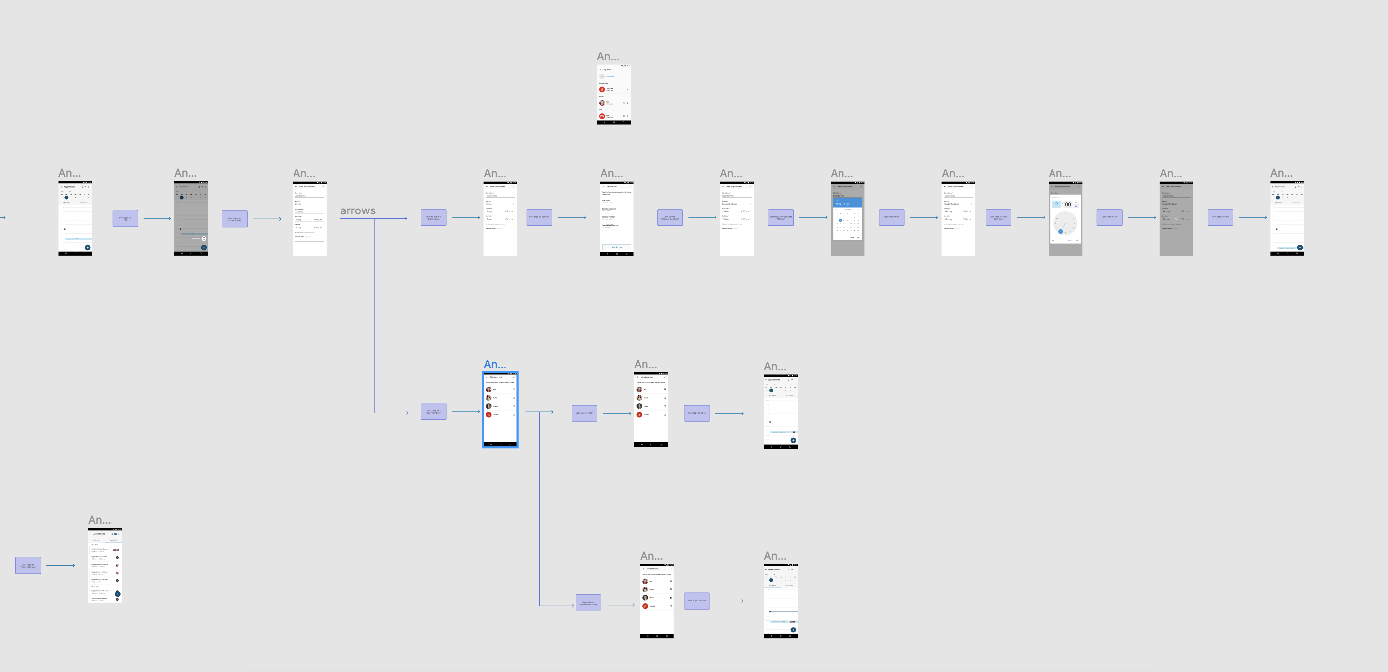
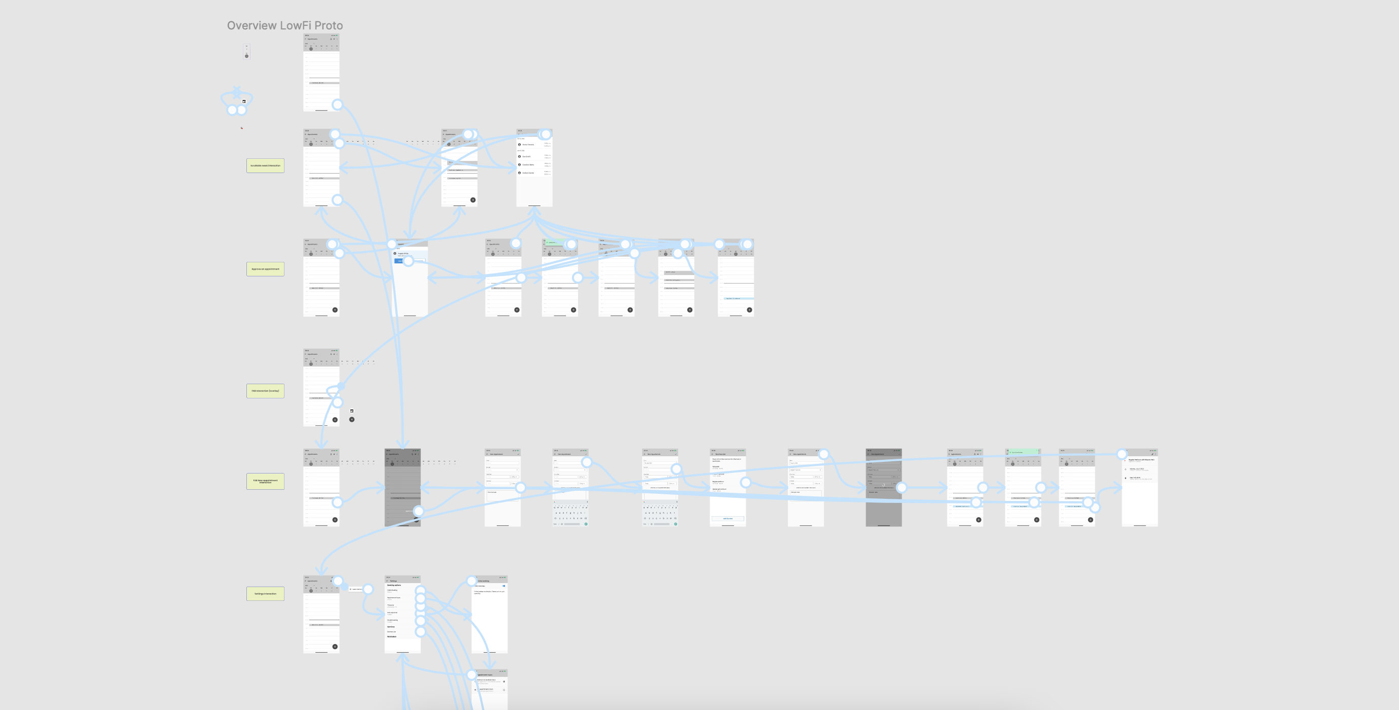
After the initial low-fi designs were presented they sparked a lot of discussion around the requirements for the feature, it was clear we needed for them to be clear and concise to proceed to the next step. After a couple of meetings with the product owner and after feedback from the team we were able to come up with more clear and more specific requirements for the feature.
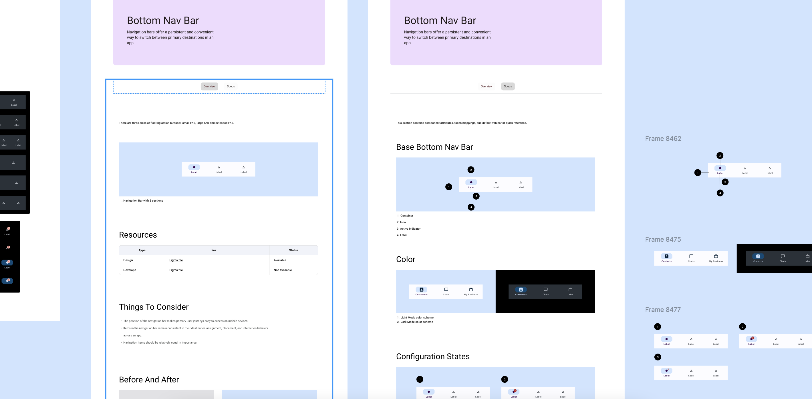
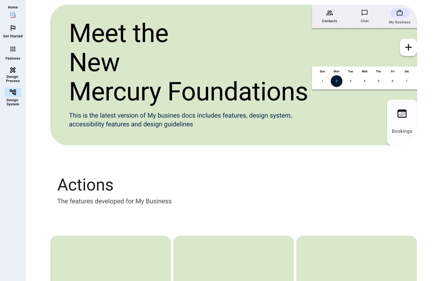
Mavenir had been using an outdated design system that had become increasingly inconsistent across iOS and Android. This meant that the user experience was disparate and confusing for users, so I proposed to create a unified design system that would be consistent across all platforms.
The team goal was to create a new design system based on an existing design system framework that would be consistent across all platforms, and create a better user experience.
Before beginning the project, I conducted research into the best practices of Material Design 3 in order to develop a comprehensive understanding of the design system. I also conducted interviews with stakeholders to better understand their needs and expectations for the project.
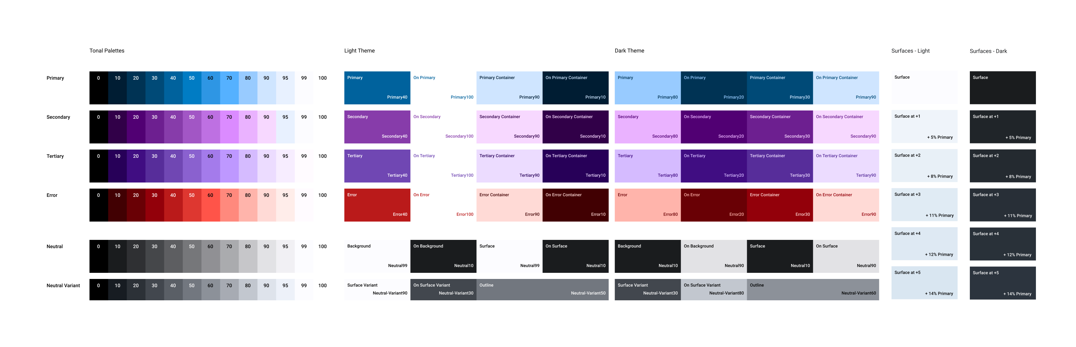
Material Design 3 is Google’s latest design language. It is based on the principles of material design, where physical and digital elements are combined to create a unified experience. It is focused on creating a consistent user experience across devices and platforms, as well as providing a modern look and feel. It also provides a library of components and tools for creating custom designs.
When deciding on the best design system for My Business, the team chose Material Design 3 for a number of reasons. Firstly, it is highly adaptable, allowing us to create a design that works across multiple devices and platforms. Secondly, it offers a great user experience, as it is designed to be easy to use and intuitive. Finally, it is scalable, meaning that it can be used for a range of projects, from simple to complex.
Whilst the team saw the benefits of using Material Design 3, there were some challenges we faced during the design process. Firstly, creating the design took a lot of time and effort, as it needed to be tailored to the specific needs of the My Business app. Secondly, executing the vision was a challenge, as it required the team to have a deep understanding of the Material Design 3 principles and guidelines.
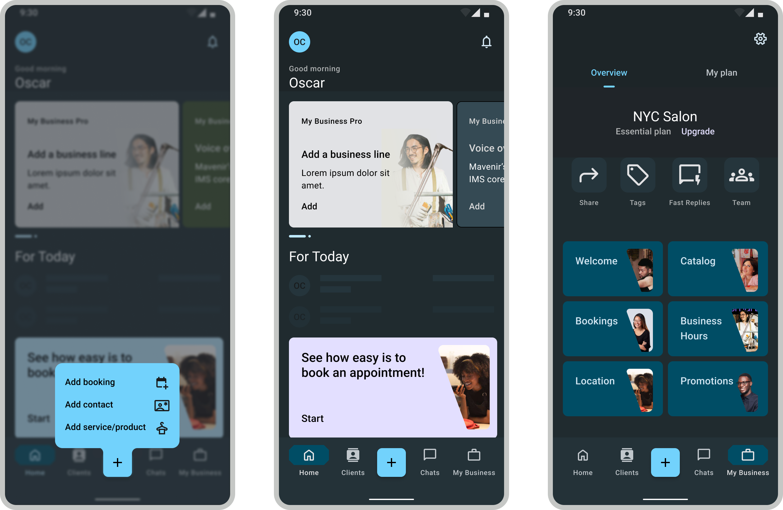
Despite the challenges, the team was able to successfully implement Material Design 3 into My Business app. This resulted in improved user experience, as the app was easier to use and navigate.
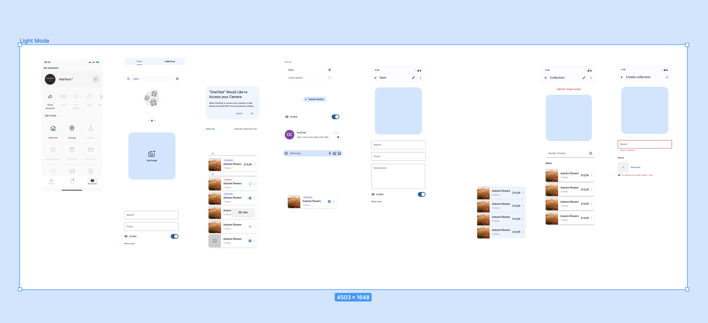
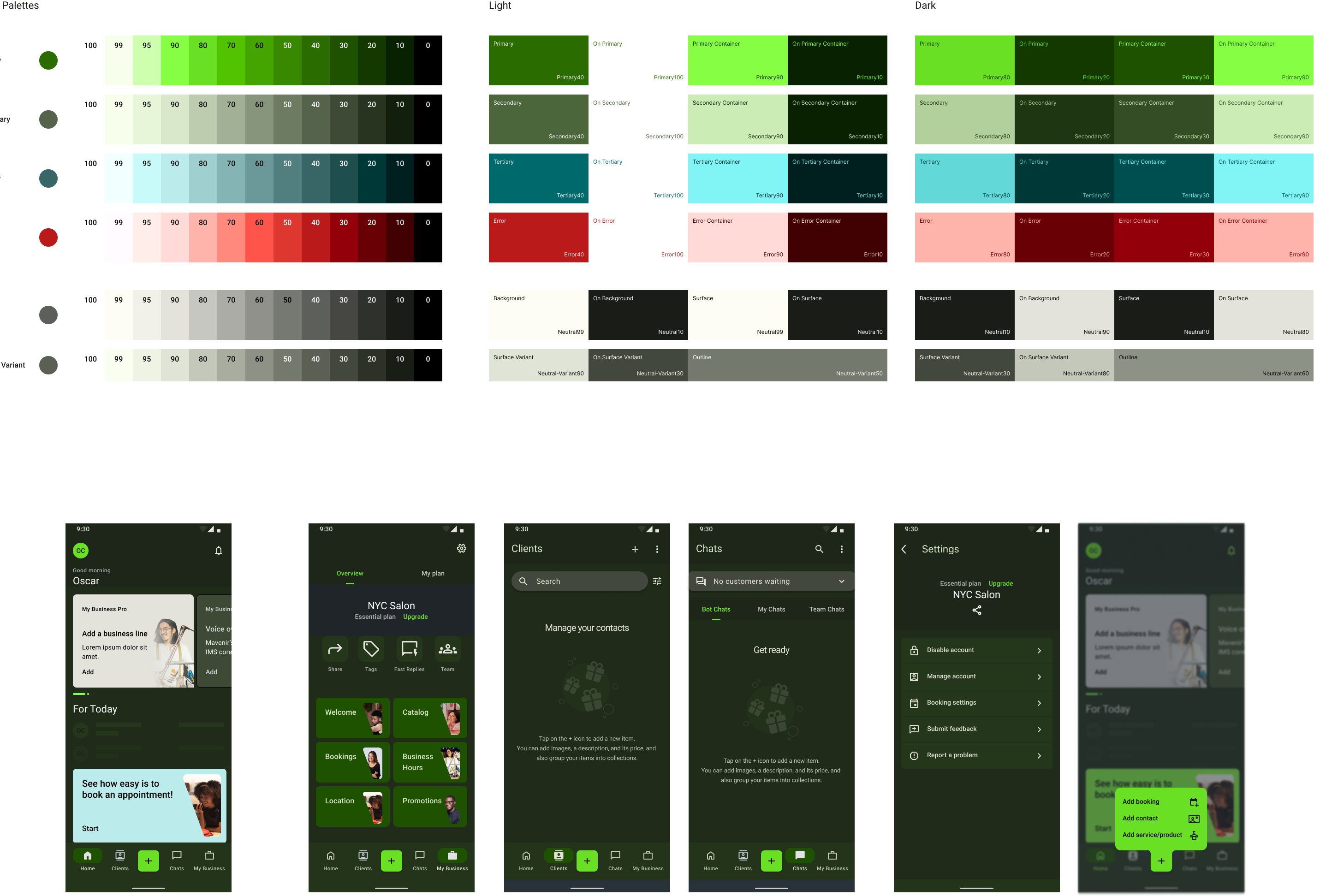
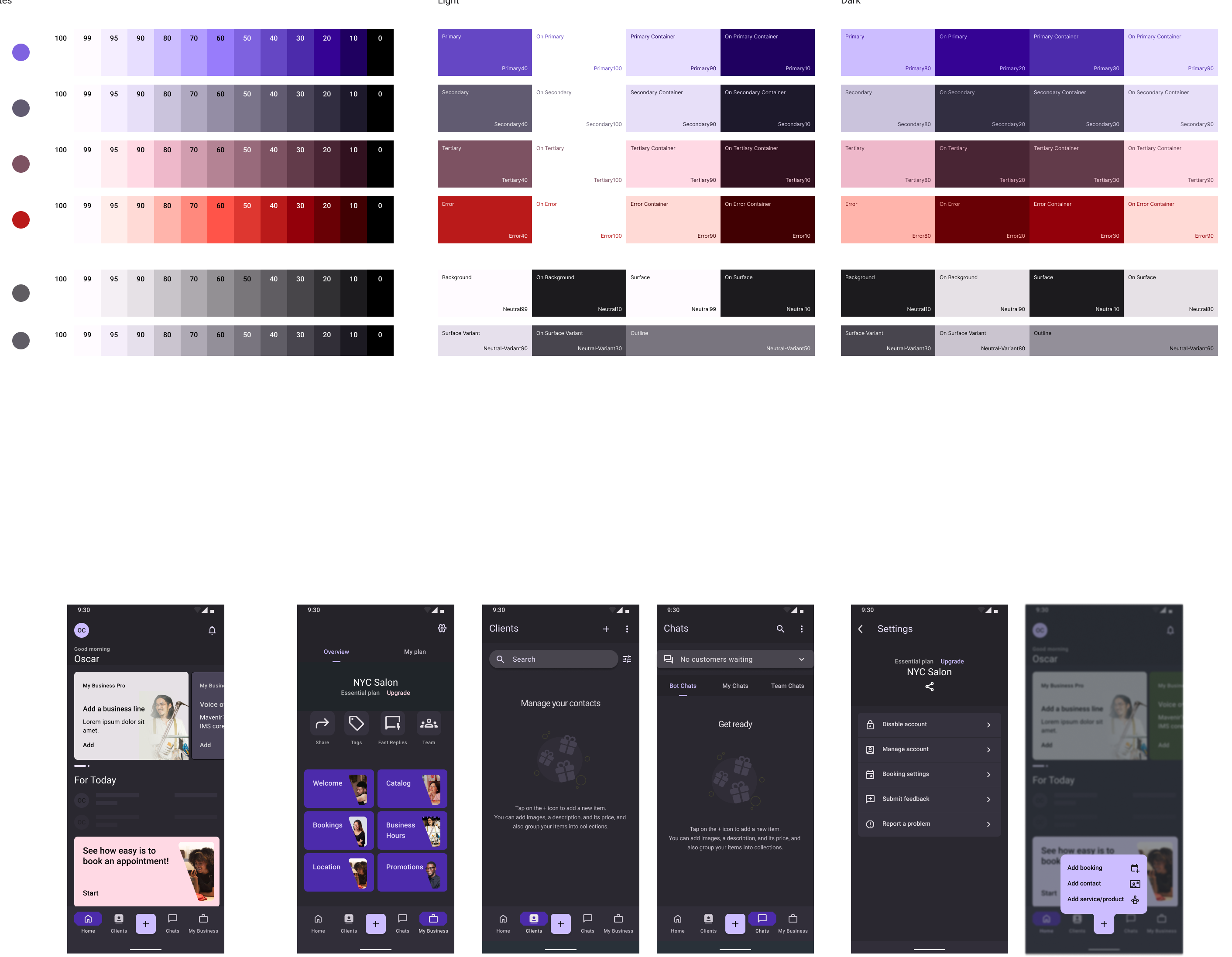
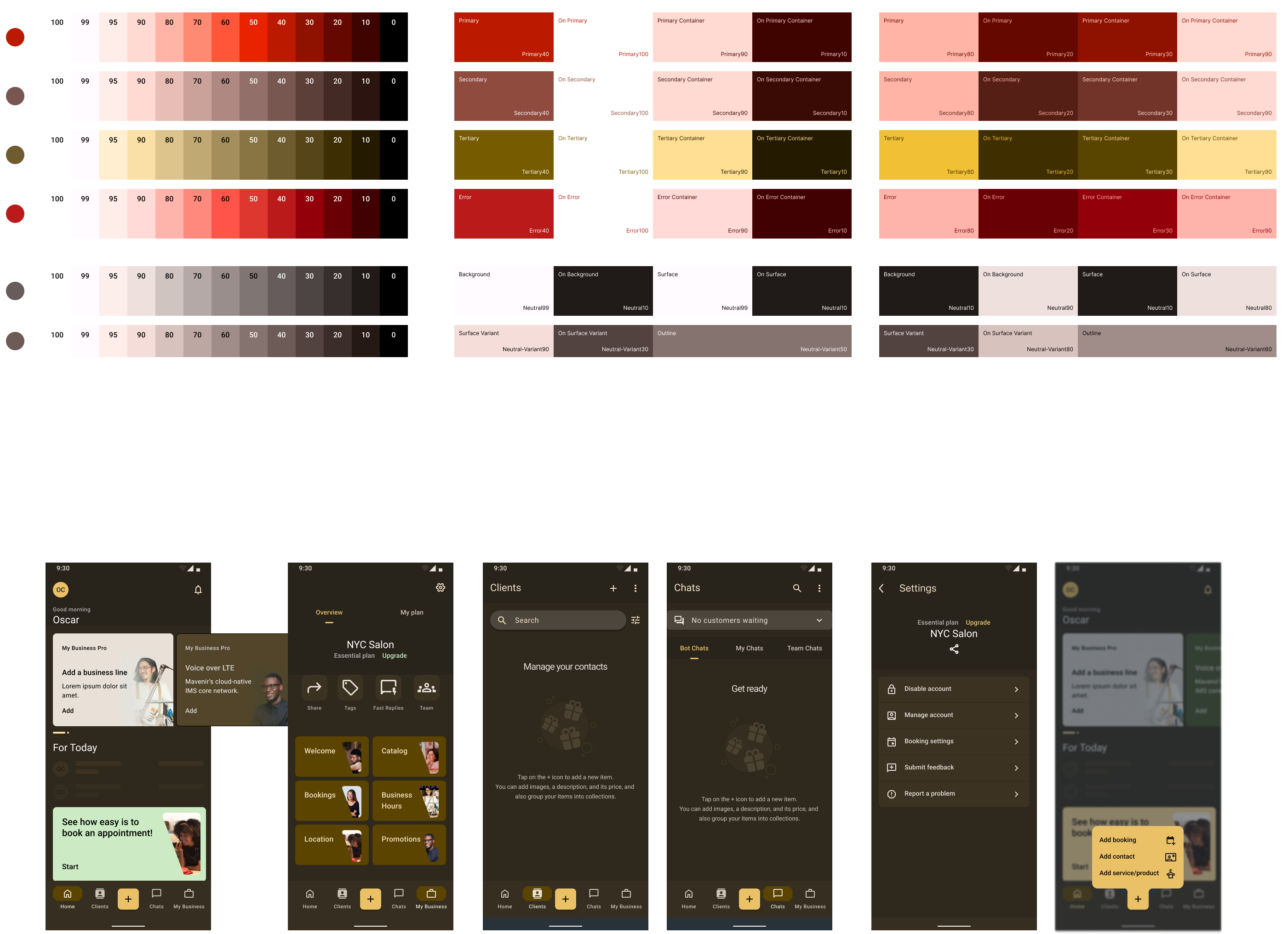
The app uses dynamic color based on the original My Business primary blue. This palette was generated using the M3 color plugin for Figma using the primary color as a seed and then further customized.
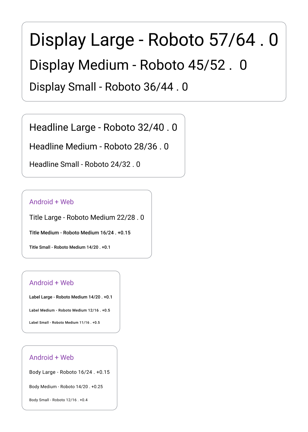
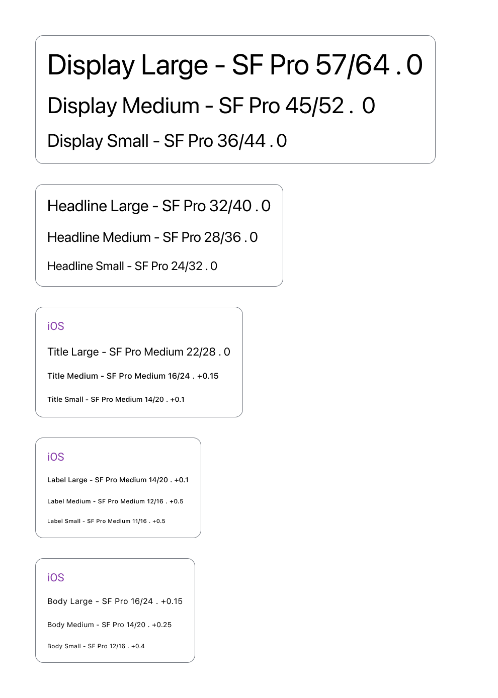
The app type scale provides the typographic variety necessary for the app content. All items in the type scale use Roboto for Android and San Francisco Pro for iOS as the typeface.
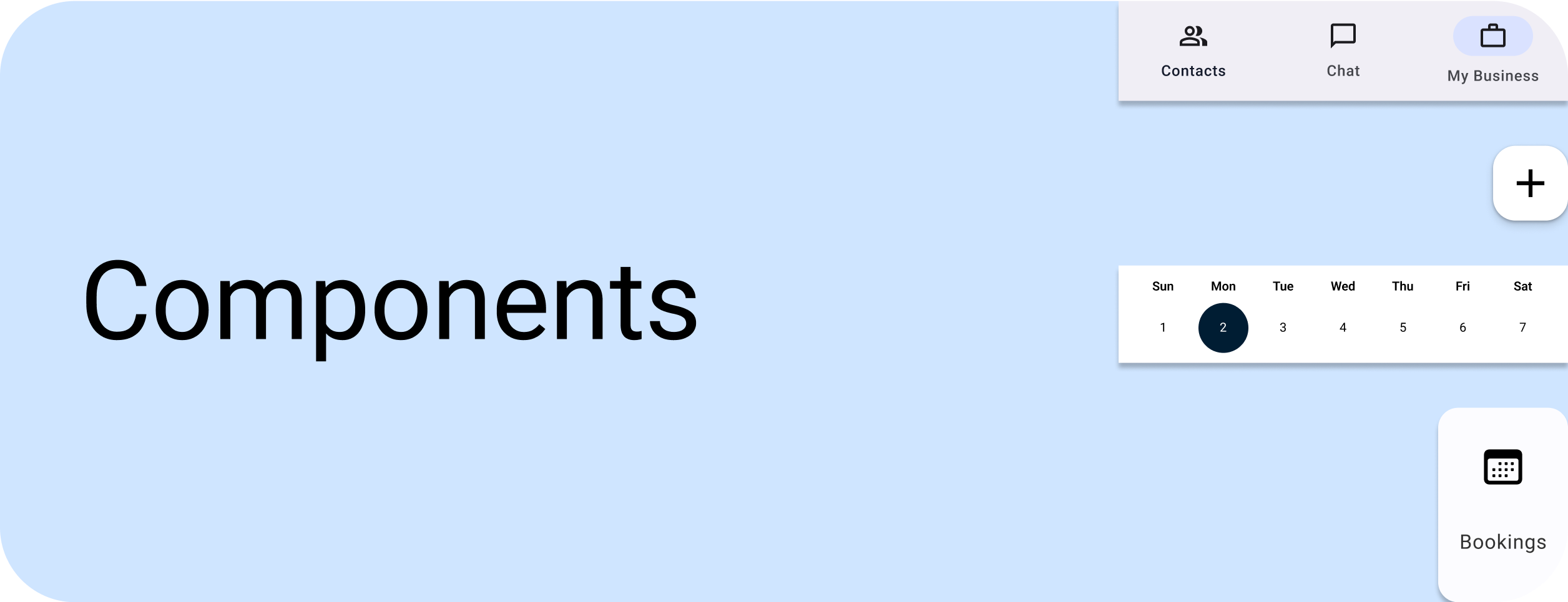
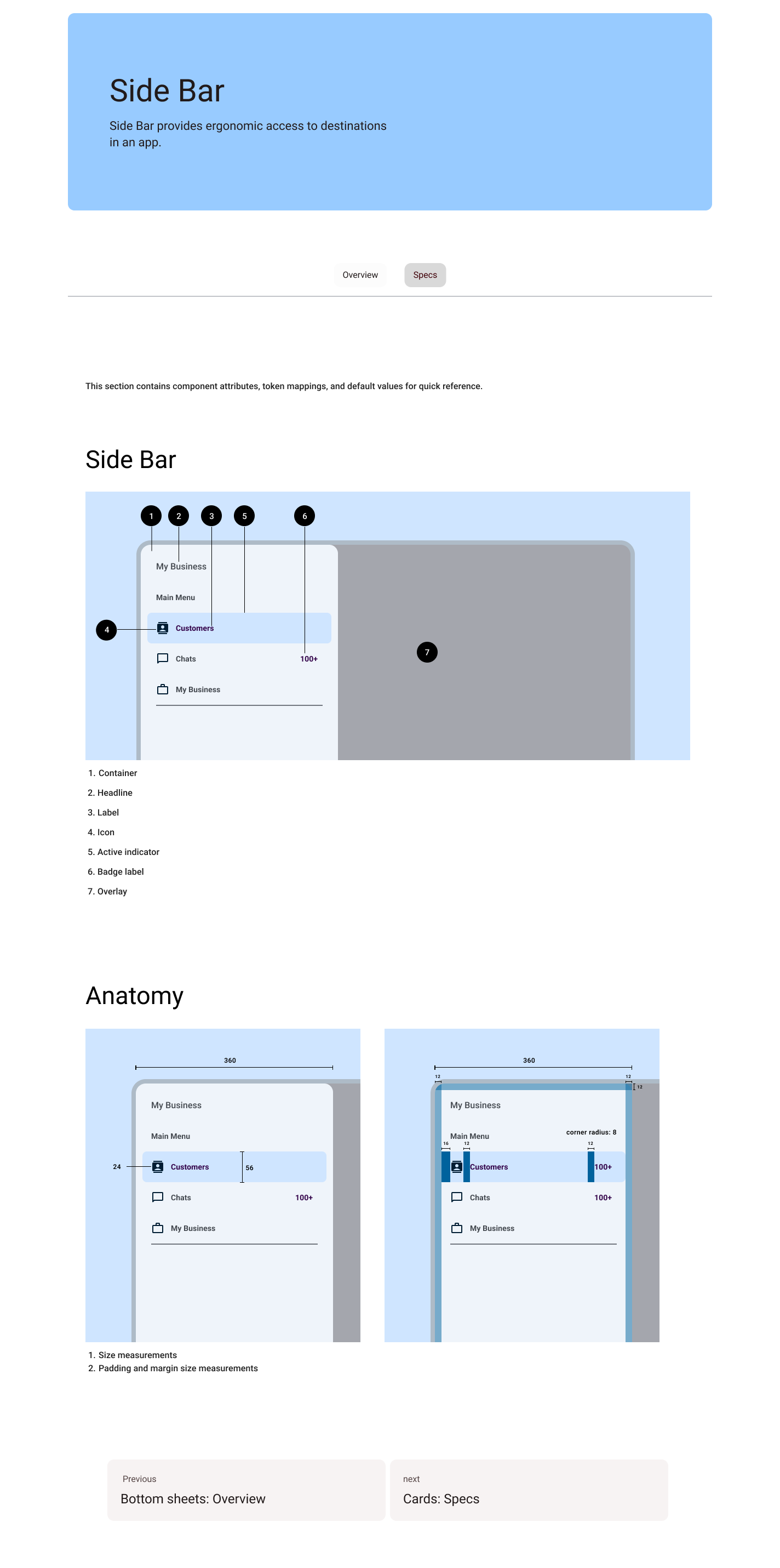
The app showcases a variety of components. From beautiful Icons to stylized but modern buttons, including contrasty dropdown menus.
I proposed to create a website where we could showcase the new design system ala “Material Design” with design guidelines, the latest documentation, and developer tools, this was mainly driven because of the constant changes in the people working on the project, to have a unified source of truth and to have clarity on components currently used in the app.
Taking advantage of Material 3 Dynamic Color framework I proposed to have this functionality implemented in the redesign of the app, we were able to visualize this with the Figma plugin, starting with different seed colors. The results were just amazing. We were really impressed by how easy was to change the whole UI color theme with one click.
In conclusion, the team at Mavenir chose to replace their old design system with Material Design 3 for the My Business app. This decision was made for a number of reasons, including adaptability, user experience, and scalability. Despite the challenges faced during the design process, the outcomes and results were positive, as it resulted in improved user experience and increased adoption.